Design comparison
Solution retrospective
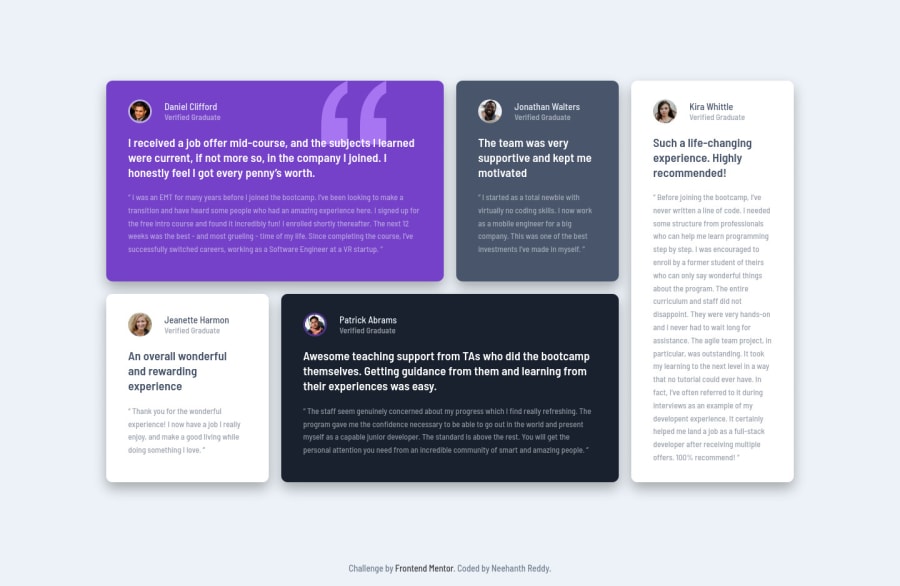
I think I've improved my css grid skills somewhat. Give me your feedback on this solution😊.
Community feedback
- @grace-snowPosted almost 4 years ago
Looks great on mobile, well done! 🙌
Only things I'd change in html are wrapping each card in a section/article (or using blockquotes) instead of a div so you associate the quote content to the person html. Similarly, lose the h2s. If they had to be a heading, they'd need to be h5s I think so it's clear they belong to /sit under the headings above for the persons name. All minor but still important changes.
I've done this challenge if you wanna see some example html using blockquotes.
Happy coding!
1 - @ApplePieGiraffePosted almost 4 years ago
Hey, nice job, M. Neehanth Reddy! 👋
Your solution looks good and responds well! I like that the content of the page doesn't grow too wide when the width of the screen increases in the desktop layout (something that others often forget to make sure of in this challenge). 👏
The only thing I might suggest is to add some margin or padding to the sides of the grid so that it isn't right up against the edge of the screen when the screen width decreases in the desktop layout. 😉
Keep coding (and happy coding, too)! 😁
0 - @Max-basical-webdevPosted almost 4 years ago
Nicely done, now my turn)
0@neehanthreddy01Posted almost 4 years ago@Max-basical-webdev yeah! thank you😊. good luck.
0
Please log in to post a comment
Log in with GitHubJoin our Discord community
Join thousands of Frontend Mentor community members taking the challenges, sharing resources, helping each other, and chatting about all things front-end!
Join our Discord
