Design comparison
Community feedback
- @correlucasPosted about 2 years ago
👾Hello Yağız, congratulations for your new solution!
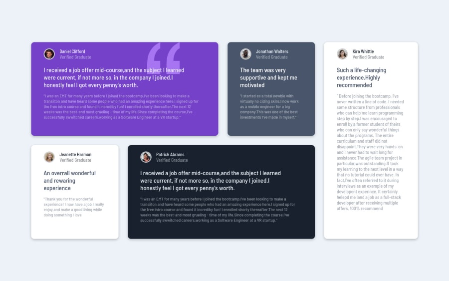
Two things you can improve i this solution, that shadow and the html markup to improve the shadow give it less
opacityto make it less dark and evident. The correct value for this shadow isbox-shadow: 5px 5px 15px 5px rgb(0 0 0 / 3%);To improve the html markup and semantic instead. Note that the main block/div that takes all the content can be wrapped with
<main>or section, aboout the cards you can replace the<div>that wraps each card with<article>you can wrap the paragraph with thhe quote with the tag<blockquote>this way you'll wrap each block of element with the best tag in this situation and use relative units asremoreminstead ofpxto improve your performance resizing fonts between different screens and devices.✌️ I hope this helps you and happy coding!
0
Please log in to post a comment
Log in with GitHubJoin our Discord community
Join thousands of Frontend Mentor community members taking the challenges, sharing resources, helping each other, and chatting about all things front-end!
Join our Discord
