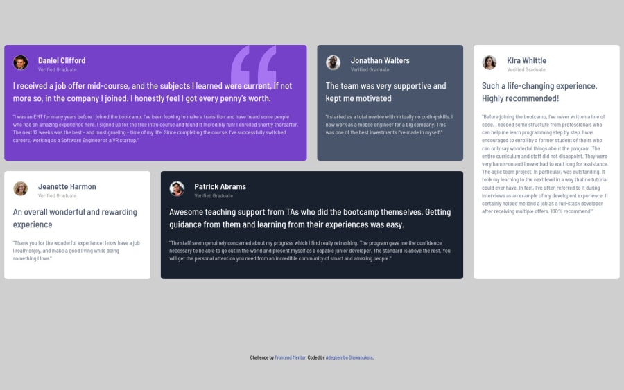
Testimonials-grid-section


Design comparison

Solution retrospective
All feedbacks will be appreciated.
Community feedback
- @farukingPosted almost 3 years ago
Your design is great(omo iya mi) but I believe it shouldn't fill the screen(just like the design itself). You can reduce the width of the main section by adding margin of 10% at (style.css line 107).
1@AdegbemboPosted almost 3 years ago@faruking Thanks for your feedback. But, the margin 10% did not make it smaller still.
0@farukingPosted almost 3 years ago@Adegbembo Ok in that case, Remove the 10% margin but make the attribution closer to the main body.
0@AdegbemboPosted almost 3 years ago@faruking it is closer now. Please, do you have any idea why my designs are showing differently on both the preview site and design/solution comparison? And how can I also prevent the testimonials from stretching?
0@farukingPosted almost 3 years ago@Adegbembo I believe its the way your layout is structured. If I were you, I won't make my outermost container(body in this case) to be a grid. Remove the grid from the body. You can also check my design for some tips.
1

Please log in to post a comment
Log in with GitHubJoin our Discord community
Join thousands of Frontend Mentor community members taking the challenges, sharing resources, helping each other, and chatting about all things front-end!
Join our Discord