@jen67
Posted
Hi there!
I hope this message finds you well. Firstly, I wanted to commend you on the great work you've done with your code👌👏—it's evident that you've put thought and effort into it.
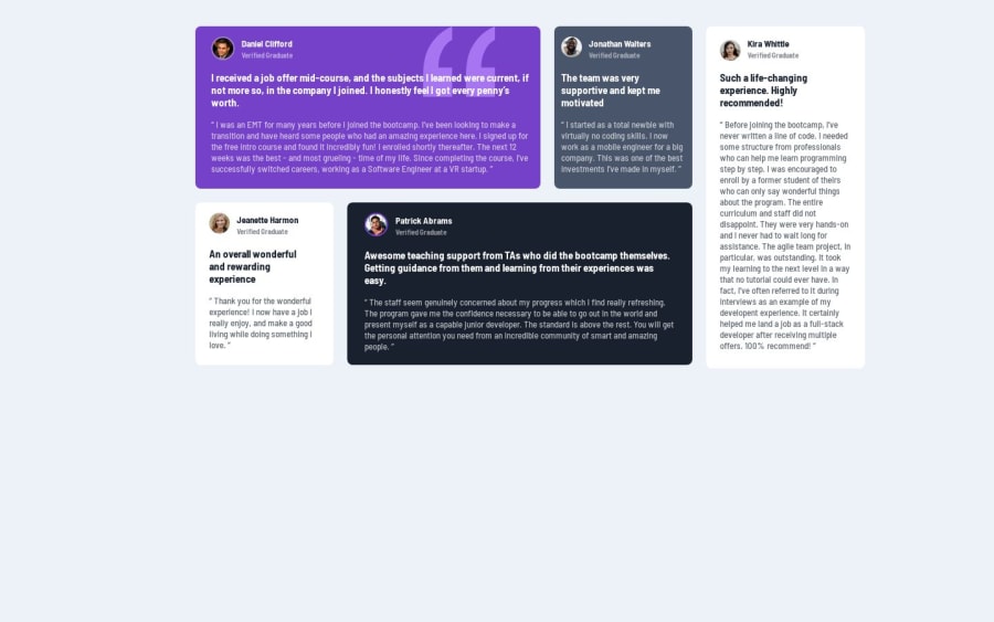
I noticed a small tweak that could enhance the overall presentation. Your layout seemed a bit tilted and too close to the top. As a suggestion, I played around with some flex properties applied to the body tag, and I believe it significantly improved the visual appeal. Here's the snippet I tried:
body {
  display: flex;
  flex-direction: column;
  align-items: center;
  justify-content: center;
  min-height: 100%;
}
This adjustment ensures a more balanced and centered appearance. Feel free to give it a try and let me know what you think. Keep up the fantastic work—I'm looking forward to seeing more of your coding brilliance!
Marked as helpful

