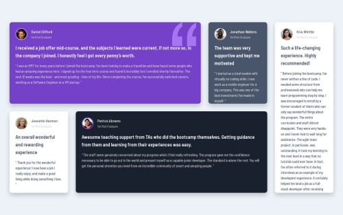
Not Found
Not Found
Not Found
Not Found
Not Found
Not Found
Not Found
Not Found
Not Found
Not Found
Not Found
Not Found
Not Found
Not Found
Not Found
Not Found
Not Found
Not Found
Not Found
Not Found

Submitted

testimonials-grid-section

@souza-vitor

Desktop design screenshot for the Testimonials grid section coding challenge

This is a solution for...

  • HTML
  • CSS
2junior
View challenge

Design comparison


SolutionDesign

Solution retrospective


What are you most proud of, and what would you do differently next time?

I didn't have major problems doing the mobile layout.

What challenges did you encounter, and how did you overcome them?

I still struggle a lot with Grid CSS and had trouble setting the height on wider screens.

What specific areas of your project would you like help with?

Any tips with Grid CSS will be of great help.

Community feedback

Monika K 200

@Monika-2509

Posted

Congratulations on achieving by finding the better solution despite facing challenges along the way! Your perseverance and dedication have led you to overcome obstacles and accomplish your goals.

Aiming to become strong in CSS Grid:

1.Understanding Grid Fundamentals: Learn about grid containers and grid items: Understand the basic structure of CSS Grid layouts where elements are placed inside a container that has been defined as a grid. grasp the concept of rows and columns: Get familiar with the grid's row and column structure, and how elements are placed within these tracks. Explore basic properties: Start with properties like display: grid, grid-template-columns, grid-template-rows, grid-column, grid-row, etc., to define the grid structure and place items within it. 2.Mastering Grid Properties:

Dive into advanced properties: Learn about properties such as grid-template-areas, grid-gap, justify-items, align-items, justify-content, align-content, etc., to fine-tune the layout and alignment of grid items. Understand flexible sizing: Explore units like fr (fractional unit) and minmax() for creating flexible layouts that adapt to various screen sizes. Experiment with auto-placement: Utilize grid-auto-flow to control how items are automatically placed within the grid, either in rows or columns, and how they behave when the grid container size changes. 3.Creating Responsive Layouts:

Practice responsive design: Learn how to create responsive layouts using media queries alongside CSS Grid. Use features like auto-fill, auto-fit, and minmax () to create grids that adapt to different screen sizes. Explore nested grids: Understand how to nest grids within grids to create more complex layouts while maintaining flexibility and responsiveness. Experiment with combining Grid and Flexbox: Understand the strengths of both layout systems and learn how to combine them effectively to build more versatile and intricate layouts. By focusing on these, you'll develop a strong foundation in CSS Grid concepts and be well-equipped to create a wide range of layouts efficiently and responsively. Remember to practice regularly, experiment with different properties and techniques.

1

@souza-vitor

Posted

@Monika-2509 Hi there! Thank you for the feedback. I'll do more research and practice these concepts you mentioned.

1
P
Lo-Deck 2,020

@Lo-Deck

Posted

Hi well done for this challenge.

It have a good responsiveness, you need to use more html tag like <section>, <article>.

It's better for the screen reader, it's like a guide for them and it's useful for SEO. <div> when you don't have any solution or to set the display.Semantic HTML

1

@souza-vitor

Posted

@Lo-Deck Hello! Thanks for your feedback! I'll make sure to keep those topics in mind when structuring my content.

0

Please log in to post a comment

Log in with GitHub
Discord logo

Join our Discord community

Join thousands of Frontend Mentor community members taking the challenges, sharing resources, helping each other, and chatting about all things front-end!

Join our Discord