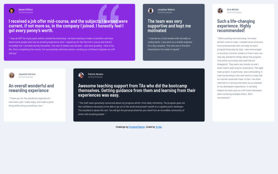
Design comparison
Solution retrospective
This is my solution for testimonials-grid-section challenge, I have difficulty for the text title the same as the design, any feedback or suggestions would be highly appreciated. Thanks for your kindness
Community feedback
- @correlucasPosted about 2 years ago
👾Hello @tltd0807, congratulations for your new solution!
Your solution is great, but the desktop version isn't properly aligned vertically. To make this alignment, first of all put
min-height: 100vhto thebodyto make the body display 100% of the viewport height (this makes the container align to the height size thats now 100% of the screen height) size anddisplay: flexeflex-direction: columnto align the child element (the container) vertically using the body asThe html markup is important and you can improve it using meaningful tags and replace the divs, for example the main div that takes all the content can be wrapped with
<main>or section, about the cards you can replace the<div>that wraps each card with<article>you can wrap the paragraph with the quote with the tag<blockquote>this way you'll wrap each block of element with the best tag in this situation. Pay attention that<div>is only a block element without meaning.SEMANTIC TAGS: Here's a complete guide for HTML semantic TAGS: https://www.w3schools.com/TAgs/default.asp
✌️ I hope this helps you and happy coding!
Marked as helpful0@tltd0807Posted about 2 years ago@correlucas thank you very much, I see what I missed, I will try right away
0 - @DavidMorgadePosted about 2 years ago
Hello To Dat, congratulations on getting the challenge done, the layout and the responsiveness looks pretty good, nice job!
If you don't mind I would like to give you a little suggestion:
Try centering all your columns in the middle of the screen using flex-box, you just have to give a
min-height: 100vhto the body so it wrapps the browsers screen, you should try something like this:body { font-family: "Barlow Semi Condensed", sans-serif; font-size: 13px; background-color: hsl(210, 46%, 95%); display: flex; justify-content: center; align-items: center; flex-direction: column; min-height: 100vh; }With this, everything will get completely centered!
Apart from that, try using a bit more semantic tags on your html, for example, your
containercould fit perfectly on a<main>tag, since thats the main part of your html page.The rest of your CSS is fine in my opinion!
Hope my feedback helps you, if you have any questions don't hesitate to ask
Marked as helpful0
Please log in to post a comment
Log in with GitHubJoin our Discord community
Join thousands of Frontend Mentor community members taking the challenges, sharing resources, helping each other, and chatting about all things front-end!
Join our Discord
