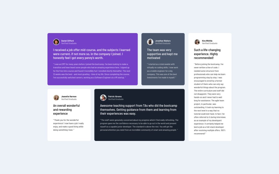
Design comparison
SolutionDesign
Solution retrospective
realizado con BEM y grid, espero sugerencias para mejorar el trabajo.
Community feedback
- @SzymonRojekPosted almost 4 years ago
Hi Catuva21,
Well done with RWD :D
A few tips below:
- in my opinion this div class="centro" doesn't have to be here;
- instead of div class="container" you can use the main tag;
- instead of section class="section" probably you can use an article;
- alt text => don't need to use words like picture or image, photo, icons in the alt text as it's already announced as being an image, so you can easily type a person's name;
- instead of h2 for the text "Verified Graduate" I'd suggest to use the p tag;
- also, this is a single page component so the h1 can use with the class sr-only set to hidden visible only for the Screen Readers (we have to use headings gradually and do not skip them => outline algorithm);
- instead of the h3 I'd suggest using the p tag because it is not a heading => bold text doesn't have to indicate on heading;
- classes are not readable and descriptive so I'd recommend learning BEM naming convention;
- max-width should have 1440px;
- check the img border color (according to the project).
Keep coding :D
Ps. Please, don't forget to upvote any comments on here that you find helpful.
Greetings :D
1
Please log in to post a comment
Log in with GitHubJoin our Discord community
Join thousands of Frontend Mentor community members taking the challenges, sharing resources, helping each other, and chatting about all things front-end!
Join our Discord
