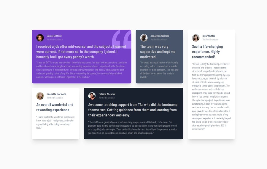
Design comparison
Solution retrospective
I have gained little exp on grid system and their working flow, learned to control them.
What challenges did you encounter, and how did you overcome them?after previous challenge this was not much challenging however, making code more efficient is definitely a challenge in this task.
Please log in to post a comment
Log in with GitHubCommunity feedback
- @rafbar2000rr
I found it almost perfect, good job. The only thing I noticed is the background color, for what I see in the design given, it should be the neutral color: light grayish blue: hsl(210, 46%, 95%). I see your code is very clean, well structured, understandable, with the comments written at the beginning of each card.
Join our Discord community
Join thousands of Frontend Mentor community members taking the challenges, sharing resources, helping each other, and chatting about all things front-end!
Join our Discord
