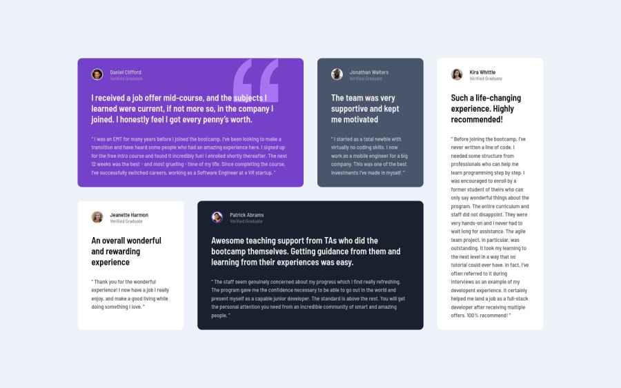
Design comparison
Solution retrospective
Any kind of feedback will be appreciated.
Community feedback
- @FrancoCarrilloPosted about 2 years ago
I really like your solution. I recommend you to use a good folders position, maybe put on the CSS files in CSS folders and the images into an assets folder is more comfortable to work in this way. Another tip is to use SASS to save lines of code, you only create one component and copy for the other components.
Marked as helpful0 - @correlucasPosted about 2 years ago
👾Hello Mahad Aamir, congratulations for your new solution!
Your solution its just perfect! You've paid attention for each details. Well done.
The only thing you can change to improve it just a little bit, is the
paragraphwith the quote replacing it with the tag<blockquote>this way you'll wrap each block of element with the best tag in this situation.And add the favicon
<link rel="icon" type="image/x-icon" href="./images/favicon-32x32.png">✌️ I hope this helps you and happy coding!
0
Please log in to post a comment
Log in with GitHubJoin our Discord community
Join thousands of Frontend Mentor community members taking the challenges, sharing resources, helping each other, and chatting about all things front-end!
Join our Discord
