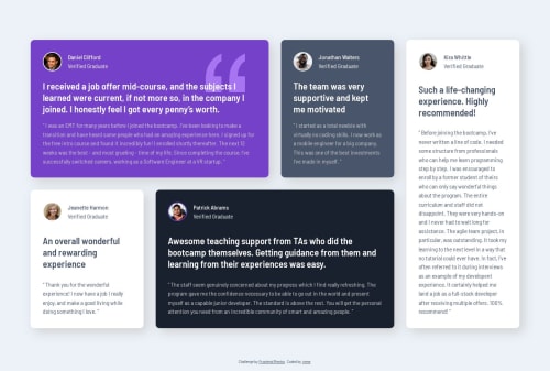
Submitted over 1 year agoA solution to the Testimonials grid section challenge
Testimonials using CSS Grid
@irene-panis

Solution retrospective
What are you most proud of, and what would you do differently next time?
getting my css grid reps in :) in terms of what i'd do differently i do want to get used to nesting in css as it looks a little cleaner that way
What challenges did you encounter, and how did you overcome them?had an issue with the grid taking up its entire parent container and looking wayyy too tall, i solved this by tacking on margins
What specific areas of your project would you like help with?im kinda not sure if the y-margins were the right call as i tend to avoid using margins if i can help it but yea lmk if there was a better way to get my grid to be "smaller"
Code
Loading...
Please log in to post a comment
Log in with GitHubCommunity feedback
No feedback yet. Be the first to give feedback on irene's solution.
Join our Discord community
Join thousands of Frontend Mentor community members taking the challenges, sharing resources, helping each other, and chatting about all things front-end!
Join our Discord