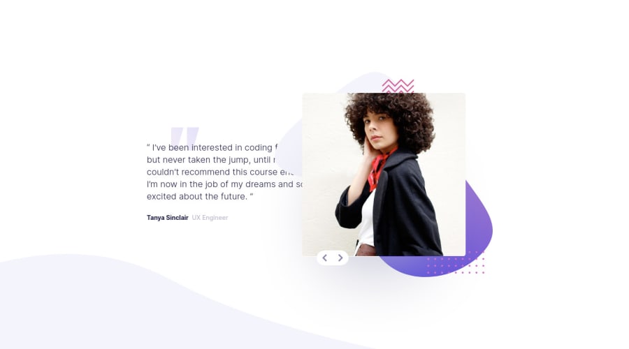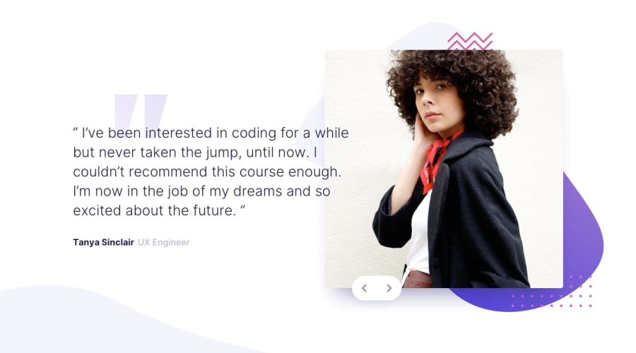
Design comparison
Solution retrospective
I would appreciate feedback on this solution.
Things that can be added to improve this solution is animation but I didn't have ideas, which to use and try. If you have any suggestions just let me know.
Community feedback
- @ApplePieGiraffePosted almost 4 years ago
Hello, Dušan! 👋
Nice job on this challenge! 👏 Your solution looks good and is responsive! 👍 The slider works pretty well, too! 😀
I suggest,
- Adding
cursor: pointerto the slider buttons. - Taking a look at your solution report and trying to clear up the errors that are (looks like you should add some
altattributes to the images in the site for accessibility purposes). - There are probably many ways to add transitions to the slider, but one idea is that you can overlay the two images on top of each other and then use JS to change the opacity of each of them when the slider buttons are clicked so that they take turns fade into and out of view. 😉
Keep coding (and happy coding, too)! 😁
Oh, and hey, if you found this comment helpful, an upvote would be appreciated! ;)
2@DEmanderbagPosted almost 4 years ago@ApplePieGiraffe Hello,
Thank you for the suggestion on your end, I've implemented the first two changes that you suggested, I've must have missed that while I was working on it but that you pointed that out.
The animation is something that I still have to implement but right now I at least have some general idea.
Thanks and happy coding.
1@ApplePieGiraffePosted almost 4 years ago@DEmanderbag
No problem! Just took another look, and the changes you already made look good! 👍 Keep it up and have fun! 😀
0 - Adding
Please log in to post a comment
Log in with GitHubJoin our Discord community
Join thousands of Frontend Mentor community members taking the challenges, sharing resources, helping each other, and chatting about all things front-end!
Join our Discord
