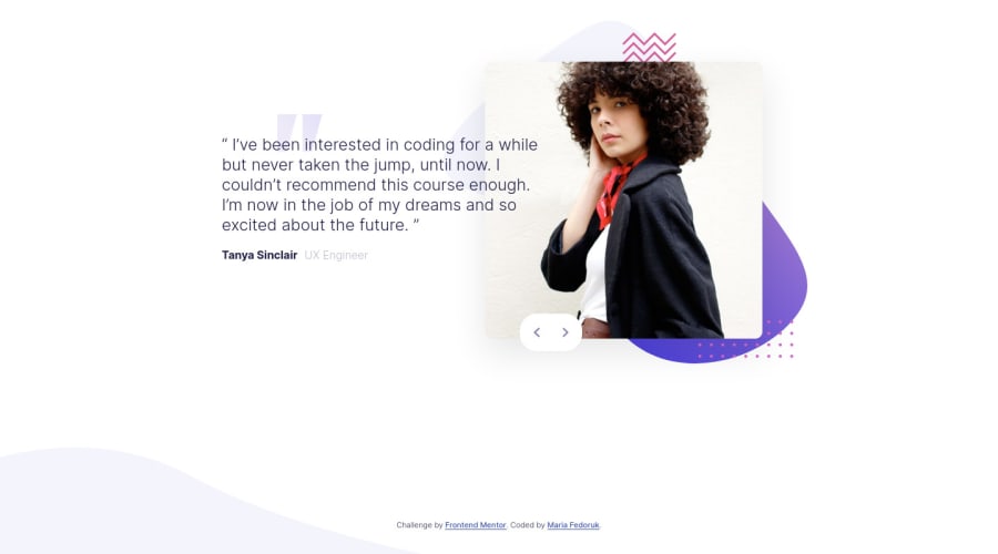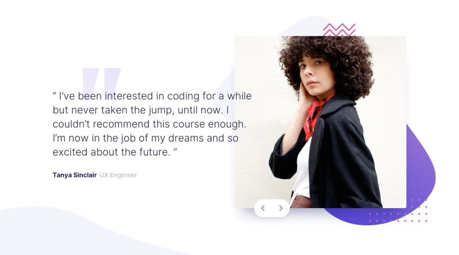
Design comparison
Solution retrospective
Hey there 👋 It's been a while! I used this challenge to reiterate on the BEM methodology and structuring content with flexbox and the grid. The buttons have been the biggest challenge, as I wanted to have a bigger "clickable area" on the button (i.e. more than the arrows icons), and have buttons react to keystrokes of right/left arrows. Proud of how it works now ☺️
If you have time to review my code, I'd love your feedback on using BEM and structuring my code overall. Thanks!
Community feedback
- @palgrammingPosted over 3 years ago
you might want to take a look at the button in my solution to this
1@itsfedorukPosted over 3 years agoHi Patrick, thank you! That was really helpful, I fixed my structure to achieve this, too 👍
0@palgrammingPosted over 3 years ago@hellomerope glad I could help. One thing I struggle with these projects is at what time do we try to make things pixel perfect and when we can change and improve them.
0
Please log in to post a comment
Log in with GitHubJoin our Discord community
Join thousands of Frontend Mentor community members taking the challenges, sharing resources, helping each other, and chatting about all things front-end!
Join our Discord
