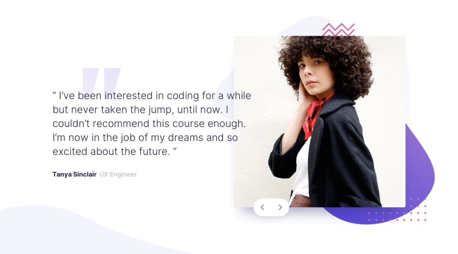
Design comparison
Solution retrospective
it was hard to adjust background and slider's position.. any feedbacks are welcome!!
Community feedback
- @dwhensonPosted over 3 years ago
Hi @0hyodorie0 some great work here. Yes the background and slider positions are tricky on this one. Some suggestions to consider for this challenge:
-
I would remove the
margin-leftthat you have on the button hover state. This moves the button out from under my cursor and it's a bit off putting. I don't think you need it? -
Small point, but where you have the class
spokeyou could try using the htmlblock quotetag with apinside it instead - I think it's nice to get used to using the different tags where we can. -
Lastly, at small viewport sizes the content is no longer centered. You can address this by setting
gridorflexon the body with the appropriate properties, or wrapping everything in adivand setting these values on that.
There are a few different ways to go about this, and it's worth finding one that works for you. I do this in pretty much every challenge to make sure things are centered properly. Let me know if you need any more info on this and I can share what I do.
And great work on the background images they look great to me! Keep up the great work.
Cheers!
1@0hyodorie0Posted over 3 years ago@dwhenson Thank you so much ! I should practice set contents centered in all viewport! it helped me a lot!
0 -
Please log in to post a comment
Log in with GitHubJoin our Discord community
Join thousands of Frontend Mentor community members taking the challenges, sharing resources, helping each other, and chatting about all things front-end!
Join our Discord
