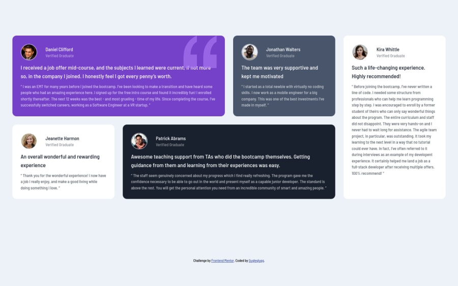


Design comparison

Solution retrospective
This one actually went faster than expected. I can't get all the spacing and sizing right because I made it from the jpg file, but I'm quite happy with how it turned out.
I'm not sure about the breakpoint between the mobile and desktop designs --- I just picked it based on resizing the viewport and looking at what looked nice (and what didn't).
I feel that there should be a tablet layout too because both the desktop and the mobile version look awkward in a tablet-sized viewport.
What are the current best practices for breakpoints? How common is it to have a special layout for tablets?
Please log in to post a comment
Log in with GitHubCommunity feedback
No feedback yet. Be the first to give feedback on Olga Ber's solution.
Join our Discord community
Join thousands of Frontend Mentor community members taking the challenges, sharing resources, helping each other, and chatting about all things front-end!
Join our Discord