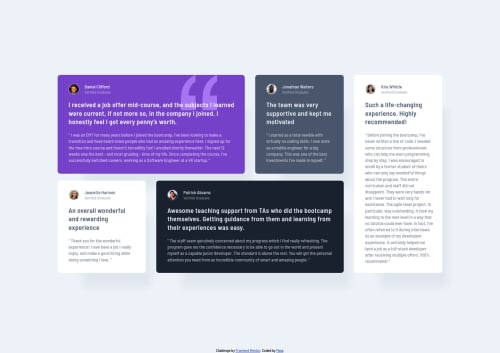
Not Found
Not Found
Not Found
Not Found
Not Found
Not Found
Not Found
Not Found
Not Found
Not Found
Not Found
Not Found
Not Found
Not Found
Not Found
Not Found
Not Found
Not Found
Not Found
Not Found

Submitted

Testimonials section with CSS Grid

maia 300

@maiaflow

Desktop design screenshot for the Testimonials grid section coding challenge

This is a solution for...

  • HTML
  • CSS
2junior
View challenge

Design comparison


SolutionDesign

Solution retrospective


I'm proud of myself for doing mobile first and for figuring out grid for the first time, but by the end I realized I probably should have relied more on things like min-height, and less on things like padding with pixels to make things "pixel perfect" to the screenshot. Even though I know I shouldn't even be trying to do that XD Curious also about how I did with my use of semantic HTML elements!

Community feedback

Lucas 👾 104,420

@correlucas

Posted

👾Hello Maia, congratulations on your new solution!

You’re in the right track I can see that you’ve used the majority semantic tags possible for this challenge, the only block you’ve missed is the paragraph containing the quote text you can improve the accessibility there using <blockquote> to indicate to screen readers that the content inside that paragraph is a quote.

✌️ I hope this helps you and happy coding!

Marked as helpful

1
Eric Salvi 1,330

@ericsalvi

Posted

Hey Maia,

Another great-looking design from you. 5 in a row!

I didn't see too much to pick at looking at the rendered solution. The only thing I noticed is that the container of the grid items on the desktop may be missing a max-width. I found that the width of the container of items on the desktop should be 1110px.

As far as the code itself, I think it looks pretty good. Adriano left a really good comment on things you could try doing in the future. Also, have a look at the Chrome extension called "axe DevTools". I run my code through this tool from the inspector and it generates a validation/accessibilty report I can try to fix before submitting it.

For your next solution, keep on trying the mobile-first approach but also maybe read up on CSS variables. For larger projects, it really helps.

Keep up the momentum!

Marked as helpful

0

maia 300

@maiaflow

Posted

@ericsalvi great call about the max width! i need to think more about the power of min and mac width. and yes, i need to get axe because the w3 validation tool screwed me! hahah. thank you!

0
Adriano 34,090

@AdrianoEscarabote

Posted

Hi maia, how are you?

I really liked the result of your project, but I have some tips that I think you will like:

1- All page content should be contained by landmarks, you can understand better by clicking here: click here

We have to make sure that all content is contained in a reference region, designated with HTML5 reference elements or ARIA reference regions.

Example:

native HTML5 reference elements:

<body>
    <header>This is the header</header>
    <nav>This is the nav</nav>
    <main>This is the main</main>
    <footer>This is the footer</footer>
</body>

ARIA best practices call for using native HTML5 reference elements instead of ARIA functions whenever possible, but the markup in the following example works:

<body>
     <div role="banner">This is the header</div>
     <div role="navigation">This is the nav</div>
     <div role="main">This is the main</div>
     <div role="contentinfo">This is the footer</div>
</body>

It is a best practice to contain all content, except skip links, in distinct regions such as header, navigation, main, and footer.

Link to read more about: click here

2- Why it Matters

Navigating the web page is far simpler for screen reader users if all of the content splits between one or more high-level sections. Content outside of these sections is difficult to find, and its purpose may be unclear.

HTML has historically lacked some key semantic markers, such as the ability to designate sections of the page as the header, navigation, main content, and footer. Using both HTML5 elements and ARIA landmarks in the same element is considered a best practice, but the future will favor HTML regions as browser support increases.

Rule Description

It is a best practice to ensure that there is only one main landmark to navigate to the primary content of the page and that if the page contains iframe elements, each should either contain no landmarks, or just a single landmark.

Link to read more about: click here

Prefer to use rem over px to have your page working better across browsers and resizing the elements properly

The rest is great!!

Hope it helps...👍

1

maia 300

@maiaflow

Posted

@AdrianoEscarabote hi Adriano, thanks for the feedback! for #1, totally understand- but looking at my code, didn't i do that? all of my content is contained in a <main>. is the problem that i used <header> and <footer> within each figcaption within the article? i read that it was okay to have more than one of those per page. i wasn't sure the best semantic element to use for the author and author subtitle- it's not exactly a header, details felt wrong because of the expand capability, etc. but i got dinged by the validation for not having a h2-h6 in my articles, so maybe i should have just done h2 and h3 for the author name and subtitle.. and very true about rem vs px! thanks! EDIT: okay, i see now! my frontendmentor attribution is outside the <main>, so it should be in a <footer>! just wanted to clarify that other than that my semantic naming was okay.

0
Yui 50

@yterai

Posted

Great work Maia, you nailed it! I should definitely practice more using semantics elements like yours - thanks for a good example :) And kudos to you for doing all the challenges it's a huge commitment!

0

Please log in to post a comment

Log in with GitHub
Discord logo

Join our Discord community

Join thousands of Frontend Mentor community members taking the challenges, sharing resources, helping each other, and chatting about all things front-end!

Join our Discord