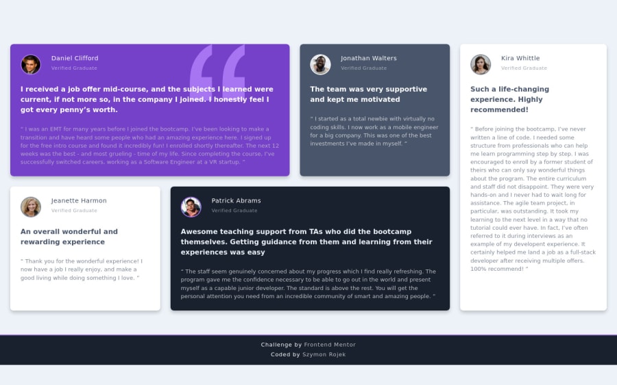
Design comparison
Solution retrospective
Hi. Please let me know if you have any suggestions - CR.
For this project I did:
- HTML semantic elements;
- Invisible content just for Screen Reader users;
- BEM naming;
- Pseudo-elements for background image;
- SASS;
- optimal layout for the site depending on device's screen size;
Thanks! :D
Community feedback
- @MasterDev333Posted almost 4 years ago
Great work! You used BEM and I love it. Your code is clean and reusable. However, it would be better if you use CSS-Grid for positioning elements rather than flex. Grid is more powerful when positioning elements horizontally and vertically. Hope it helps. Happy coding~ :)
1@SzymonRojekPosted almost 4 years agoHi @MasterDev333,
Thank you so much for feedback. I do not feel comfortable with the grid yet. Firstly, I need to master the flexBox because is a very powerful technology and I want to familiarize with all its details. Hopefully I will start to learn the grid soon because it is the best for layouts and with flexbox you can do lots of things with the content.
Have look this article, I really like it.
Have a nice day, :D
0 - @qb-rivkybPosted almost 4 years ago
Wow really nice!! 👍 I like the hover transition!
1@SzymonRojekPosted almost 4 years ago@qb-rivkyb
Hi,
I appreciated it but I would like to mention that I removed it. There was a quite big problem with the flickering text (was moving, jumping a bit). Honestly, I've spent few hours on debugging code.. it was like a war hahaha 🙂 I did lots of research, read few articles, fixing the code many times - of course, there are pluses of it. For example, it is better to write more simple code and do not give unnecessary additional effects like my transform scale on hover :)
The experienced developer was against using the scale transform on anything with text in it. She said: that it can be disorientating and make the text a bit blurry so it is better to add a hover effect to something clickable - scale like this would be appropriate on an image (inside a link tag) that opened up a larger version of it in a lightbox, for example. Hover is usually used to indicate interactivity though. What can I say, she's got right! And I am happy with it :)
Greetings :)
0@statanasovaPosted almost 4 years ago@SzymonRojek Maybe that's a bit weird, but I'm just dropping a line to tell you that I like your attitude! :D
Because you added an effect, people liked it, you troubleshooted it for hours... But you still removed it when it turned out it can cause UX and accessibility issues. Plus you consulted a more experienced developer and you actually listened.
Well done! That mindset is one of the greatest things you can see in a developer, in a coworker, in a person in general :) So keep it up!
PS. I have a tip for the colors in the cards - you can make all of the texts in each card the same color and just play with the opacity for the elements. So colored cards get only white texts with different opacity, and white cards - only gray texts with diff. opacity. It evens out colors nicely and leaves the guesswork out of the process.
See you around :)
1@SzymonRojekPosted almost 4 years ago@statanasova
What can I say... WOW definitely it is not weird! Amazingly, you're saying very important feedback straight to me. As I've written above in the comment - I have spent probably more than one day to find a proper solution - after this time I didn't give up and there is a huge possibility that I could spend even more time on it. Finally, I've decided to ask someone experienced. She's got a right and I'm very very happy with it. Accessibility is essential and very difficult to achieve - it takes lots of time.
Thanks for the tip with the colours and opacity. Now I'm finishing another small project from the frontEndMentor.io and probably after that I would like to come back to my previous projects and check them again - for example, change a bit my sass nesting etc.
See you around, Greetings and Happy New Year :D
0 - @ApplePieGiraffePosted almost 4 years ago
Hey, good work on this challenge, Szymon Rojek! 👏
Your solution looks good, responds well, and your HTML is very semantic (as you said)! 🙌
Keep coding (and happy coding, too)! 😁
1@SzymonRojekPosted almost 4 years ago@ApplePieGiraffe thank you so much! I am so glad to read it. I didn't use the grid because I don't feel comfortable with it yet - instead of it, I've used the flexBox. I need to master the flexBox because is a very powerful technology and I want to familiarize with all its details. Next time will be the grid. Thanks again for the feedback. :D
1@ApplePieGiraffePosted almost 4 years ago@SzymonRojek
NP! Both flexbox and grid are great solutions to layout in CSS. 👍 Keep learning! 😀
1
Please log in to post a comment
Log in with GitHubJoin our Discord community
Join thousands of Frontend Mentor community members taking the challenges, sharing resources, helping each other, and chatting about all things front-end!
Join our Discord