Design comparison
Solution retrospective
What I always think about when coding each challenge is whether or not to write my code like I would do for a real life project (so considering that it might be edited a year or two after) or just to make everything look like on the design and not really consider any future updates/ changes.
At the moment I always try to make my code easily editable and as I would code for if I was hired by someone to do it.
How do you guys approach this?
Cheers! Adam
Please log in to post a comment
Log in with GitHubCommunity feedback
- @ErayBarslan
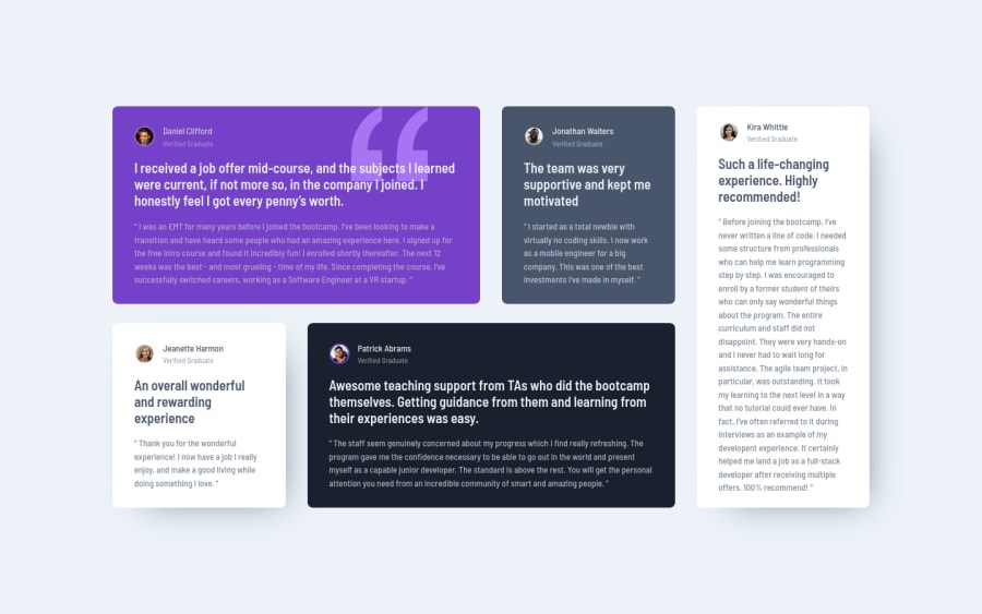
Hey there, great work on this one! Design is almost pixel perfect and responsive. To your question I'd say why not both ^^ Clean and maintainable code is always prefered but that can still be achievable by respecting the design. Putting accessibility, responsiveness etc. aside since they're a must in production, main task would be to get close to the design. Though there may be edge cases like using
justify-content: space-betweenand almost getting the same result but one element is off by a few pixels. That might be a design choice for better user experience or a small error that wasn't intended. I believe in this sort of cases if you're not sure which, best option would be to simply communicate with the designer because we may get different answers.For example in this challenge, there is a slight difference between column and row gap that's not noticable at first sight but is still there and I think that's done for design purposes. In this case instead of using just
gap, separating column and row would be convenient approach to respect the design. Opinions might differ but this is my take on the matter ^^ Regarding your solution you can lower the gap a bit to make it pixel perfect but nothing else I'd suggest, excellent solution and happy coding :)Marked as helpful - @correlucas
Hello @achrustowski, congratulations for your new solution!
Your solution seems already really good. Something you must having in mind when showcasing your skills is to have your code with a good semantic, for the big blocks of element don't use divs since they dont have a meaning, choose other tags thst describe the content.
for example the main div the wrap the cards you can replace the
<div>that wraps each card with<article>and the paragraph with the quote with the property tag<blockquote>this way you'll wrap each block of element with the best tag in this situation.Other stuff you should think is having a clean code and avoiding the use o unnecessary divs.
Hope this helps, happy coding!
Marked as helpful - @achrustowski
Hi @correlucas,
Thanks very much for your feedback. I indeed have been using semantic elements in my previous solutions, but then what I would get is accessibility issues.. not sure why.
Any idea why when I use semantic elements I'm getting accessibility issues?
Cheers, Adam
Join our Discord community
Join thousands of Frontend Mentor community members taking the challenges, sharing resources, helping each other, and chatting about all things front-end!
Join our Discord
