Design comparison
Solution retrospective
Any feedback will be appreciated
Please log in to post a comment
Log in with GitHubCommunity feedback
- @AlexKMarshall
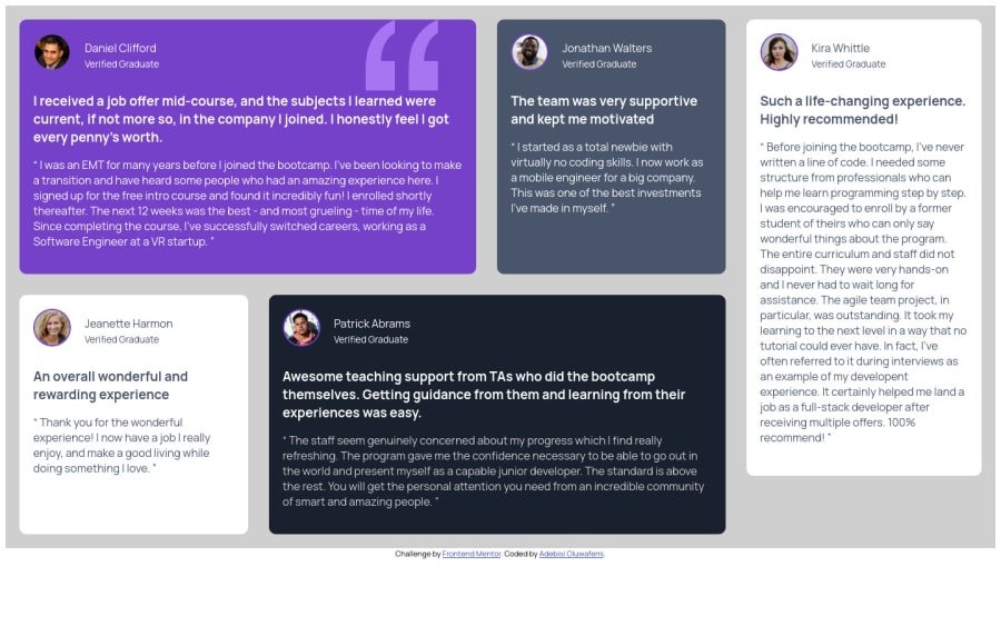
This is looking good, it's responsive down to a good small size, and it doesn't overflow.
There are a few things that would be worth looking into.
Your heading levels: You have h3's but no h2's or h1. Always make sure to use your headings at the correct level for the context you're in.
It gets very wide on big screens. I would look into putting a max-width on your container and centering it, so that it doesn't get too big.
To my eyes, the paragraph text could use a slightly bigger line height, it looks a bit squashed.
Look into the
<blockquote>element. It would be a bit more semantic than a generic<section>Marked as helpful - @Albusflames
waw . Bro I need to jot all this down .SO as not to do the same in my next project. This is really healpful thanks
Join our Discord community
Join thousands of Frontend Mentor community members taking the challenges, sharing resources, helping each other, and chatting about all things front-end!
Join our Discord
