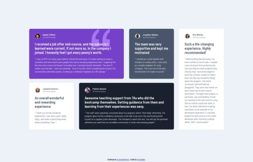
Testimonials page using grid

Solution retrospective
I'm proud of noticing some really sneaky details in the styling of this project (the borders around the avatars for example). Next time I might not worry so much about these small details and try having a more time-efficient approach.
What challenges did you encounter, and how did you overcome them?I came down with a nasty flu in the middle of this project and more than a week passed before I was able to get back to it. It was pretty challenging to get my head back into the project. I was glad that I had kept my code pretty clean and used quite a few comments to help me reacquaint myself with the project.
What specific areas of your project would you like help with?-
I built this so that the desktop and mobile layouts are pretty rigidly defined in sizing to match the Figma files. Would it be better in terms of responsiveness to not absolutely define the testimonial card sizes to allow them to grow and shrink to fit different screen sizes?
-
How does frontend mentor generate the comparison screenshot of my project? It shows some variation in the text vs the design that does not appear when I view my project in various browsers (Chrome, Firefox, Brave). Is there something in my code causing this discrepancy?
Please log in to post a comment
Log in with GitHubCommunity feedback
No feedback yet. Be the first to give feedback on Fish Ladder's solution.
Join our Discord community
Join thousands of Frontend Mentor community members taking the challenges, sharing resources, helping each other, and chatting about all things front-end!
Join our Discord