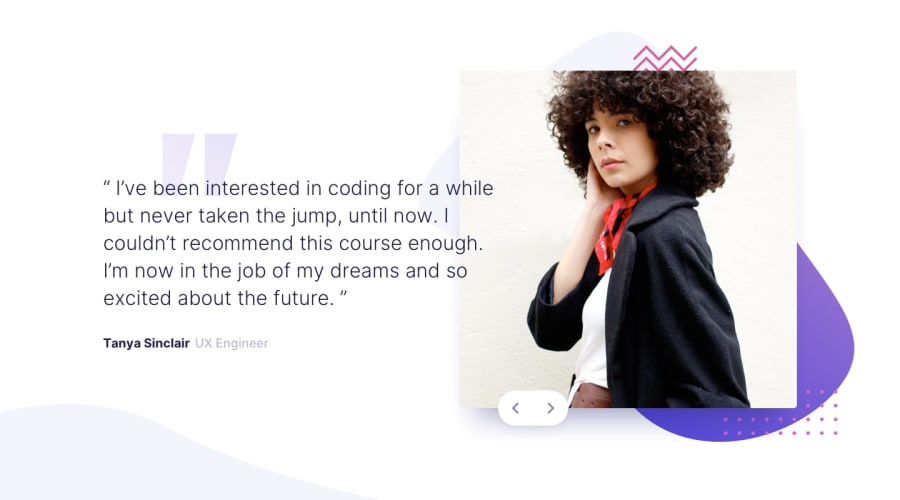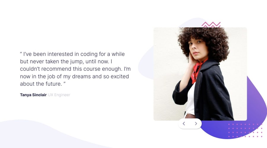
Design comparison
Solution retrospective
Hello community, I have solved another exercise, applying little logic with js, and more design in the part of css that complicated me a little. How can I make the text to be above the image? I tried to play with the positions, but it gives me a lot of problems with the heights, that is an inconvenience that I had. Please if you have any improvement for my code, design, or accessibility, I would be very grateful to know in the comments. Happy coding. 🍔
Community feedback
- @Tryt4nPosted over 1 year ago
Your path for
::before
pseudo element inblockquote
is wrong. Personally I think it would be better use::before
or::after
on your personimg
instead of adding anotherimg
element which has only a decorative function.Also would be better if you would add your buttons in
img
section. Would be easier to place them. Currently they always have different placement. Instead of that it they would be inimg
container you could position them absolutely to that container then addbottom: 0;
left: 0;
andtranslate: 100% 50%;
and it would be exactly the same as in the project.Also because you use
top
andleft
on your buttons container with such a massive number (40rem
and60rem
) it's completely mess with your media query. Below 1100px your buttons overlapping yourbody
.Your media query for mobile should start below around 1024px in my opinion. Even when I disabled
60rem
forleft
for your buttons theimg
element is getting started to be very small.And some typo:
- your both buttons have the same
aria-label
Marked as helpful1 - your both buttons have the same
- @FETYagencyPosted over 1 year ago
hey brother i swear it is a nice attempt and here is some points that i think will improve your design
- make that button positioned relatively to the viewport instead the inline_start of the wrapper container because it will cause you an overflow.
- you can wrap all the images in one container and attach their sizes to the inline size of the container to make them look like a united item.(you can use the container query, the "cqi" unit to achieve that and rely on the inline-size property powered by the clamp function and set the flex-basis to "auto" if you are using the flex blox).
- never forget to use the max-inline-size property to avoid your design getting over-expanded
- use several media queries with specific text styles so to avoid that creepy shrinks and breaks in your text (it is very important when your are working with a brand that want to establish its identity in the users brain).
Marked as helpful1
Please log in to post a comment
Log in with GitHubJoin our Discord community
Join thousands of Frontend Mentor community members taking the challenges, sharing resources, helping each other, and chatting about all things front-end!
Join our Discord