Design comparison
Community feedback
- @visualdennissPosted over 1 year ago
Great work there Manuel,
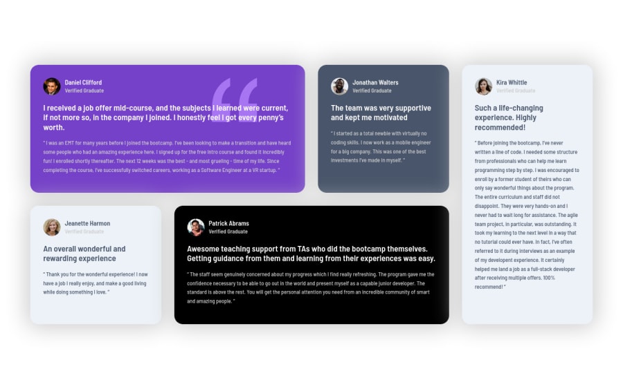
Your CSS Grid solution looks very responsive. I'd like to point out that box-shadow you have used seem to brighten inner parts of testimonials with dark background, which is not ideal in my opinion. Of course it is a matter of taste eventually, but i'd like to suggest you a resource with lots of professionally designed box-shadows you can use if u want: https://getcssscan.com/css-box-shadow-examples
Hope you find this feedback helpful!
Marked as helpful1@manueldavid95Posted over 1 year ago@visualdenniss Gracias por tomarte el tiempo de ver mi desafio :D
0 - @Finney06Posted over 1 year ago
Hello Manuel👋. Good job on completing the challenge !
To clear the Accessibility report:
- Starting with
<h1>and working your way down the heading levels (<h2>,<h3>, etc.) helps ensure that your document has a clear and consistent hierarchy.
I hope you find it helpful!😏 Above all, the solution you submitted is 👌. 🎉Happy coding!
Marked as helpful1 - Starting with
Please log in to post a comment
Log in with GitHubJoin our Discord community
Join thousands of Frontend Mentor community members taking the challenges, sharing resources, helping each other, and chatting about all things front-end!
Join our Discord
