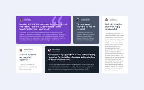
Submitted almost 4 years agoA solution to the Testimonials grid section challenge
Testimonials | HTML CSS | Responsive
accessibility
@10high

Solution retrospective
I like the final result, but feel I still spent way too long matching it to the original. The Perfect Pixel Chrome extension was a big help, though.
I suspect my solution may be overly complicated, but I do like how it scales up and down.
Any feedback welcome! :)
Code
Loading...
Please log in to post a comment
Log in with GitHubCommunity feedback
No feedback yet. Be the first to give feedback on Michael Waaler's solution.
Join our Discord community
Join thousands of Frontend Mentor community members taking the challenges, sharing resources, helping each other, and chatting about all things front-end!
Join our Discord