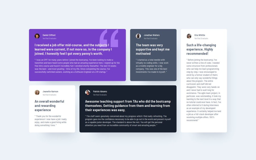
Design comparison
Solution retrospective
Finally managed to get it to fit right.
What challenges did you encounter, and how did you overcome them?Was hard to make it responsive, while making sure all the content is fits in the containers. Also as the screen sizes get bigger - it starts looking slightly more awkward.
What specific areas of your project would you like help with?I'd like to know any ideas on how to make the overall design look better on larger, more awkward screen sizes.
Also, how to make text fit the container depending on the size of the container.
Community feedback
- @Grimm-NPosted 5 months ago
Amazing work! 👏 I love how much effort you’re putting into this design – it really shows. Keep it up! 🎉 Here are a few suggestions to help refine things even further:
-
Use relative units instead of pixels – Opt for units like
remoreminstead ofpx. These units adapt better to different screen sizes and user preferences, making your design more flexible and accessible. For example, if someone has increased their browser’s default font size,remandemwill adjust accordingly, whilepxremains fixed. -
Tackle font scaling on large screens – When using
em, you might notice fonts becoming too large on bigger screens becauseemscales based on its parent. To avoid this, try using a combination ofclampfor font sizes. For example:font-size: clamp(1rem, 2vw, 1.5rem);This allows you to set a minimum and maximum font size, ensuring it stays proportional without getting out of control.
-
Plan for medium screen sizes – For screens that are not too small or too large (like tablets), consider a transitional layout. For example, instead of single-column items, you could use a grid with two columns to optimize space usage and make the design look more structured:
.grid-container {
    display: grid;
    grid-template-columns: repeat(2, 1fr);
    gap: 16px;
}
This keeps your layout balanced and user-friendly across different devices.
-
Download and use custom fonts – It’s better to download fonts and add them using
@font-facein your CSS. This gives you control over font loading speed, avoids third-party service dependencies, and ensures your design stays consistent even if the external service has issues.
You're doing fantastic work! Keep experimenting, and you’ll keep improving! 🌟
Marked as helpful1P@whiteriver-devPosted 5 months ago@Grimm-N
Thank you! Your point #2 is really useful for the problem I was struggling with
0 -
Please log in to post a comment
Log in with GitHubJoin our Discord community
Join thousands of Frontend Mentor community members taking the challenges, sharing resources, helping each other, and chatting about all things front-end!
Join our Discord
