

Design comparison

Solution retrospective
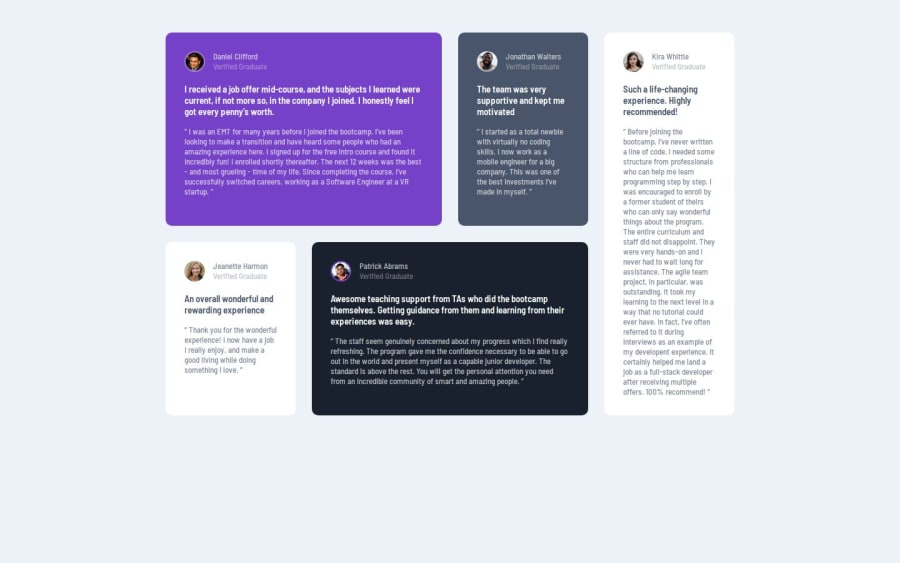
I wrote the HTML and CSS portion of this project pretty quickly. I don't have access to Pro, so I had to rely on the design imgs provided to figure out spacing and font-size, so I've accepted that my solution will have some differences to the final design.
What challenges did you encounter, and how did you overcome them?I had to watch a tutorial on CSS grid to figure out how to code the desktop design. I'm still not entirely comfortable with Grid, but this project helped a lot with getting there.
What specific areas of your project would you like help with?There's a bit of white space left on the bottom of the cards with shorter reviews. I tried messing with font-size and padding/margin to get it closer to the final design imgs, but there's still a bit of space left in Jeanette's card.
Also, I used the colors in the provided styles md, but they still look off compared to the final design.
Community feedback
- @YacoubDweikPosted 4 months ago
Hey!
Good job the fact that you have just learned Grid and this is the result is surprising!
I don't have much to say, the white space in the cards is due to the fact that you did not define align-items to be center, now it's default value is stretch so that's why you see all cards are stretched to fill the full height of their parent which is the container that you already gave a min-height.
Keep it up!
Marked as helpful2

Please log in to post a comment
Log in with GitHubJoin our Discord community
Join thousands of Frontend Mentor community members taking the challenges, sharing resources, helping each other, and chatting about all things front-end!
Join our Discord