

Design comparison

Solution retrospective
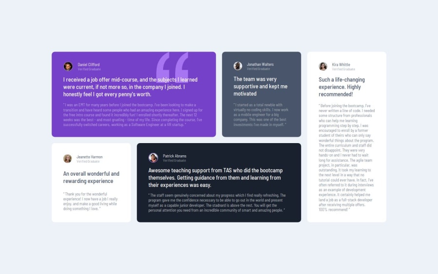
I'm really happy with how I pre-empted cascading layout properties to all cards, but using a separate class for each color setting. The separation between layout and skin means I could minimize code. Taking that minute to look at the design overall, and think about what to cascade and how to apply classes, really pays off.
I didn't pre-empt needing a div for person image and name, so had to go back and wrap each markup individually.
I learned that the gap property can be used for flex children, not just grid cells.
I had to Google background image properties to get the quotes like the design.
What challenges did you encounter, and how did you overcome them?I spent a lot time fine-tuning vertical margin between text elements. Until, I finally realized each section is just evenly spaced. A quick space-around property for the card class, and problem solved.
What specific areas of your project would you like help with?Nothing seemed ambiguous for this project.
Please log in to post a comment
Log in with GitHubCommunity feedback
- @zzdevs
Good work!

Join our Discord community
Join thousands of Frontend Mentor community members taking the challenges, sharing resources, helping each other, and chatting about all things front-end!
Join our Discord