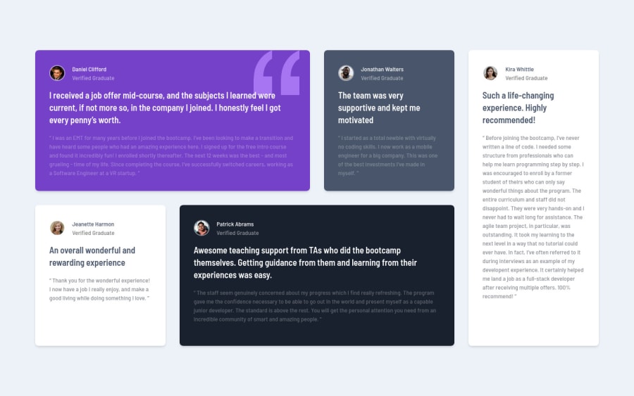
Testimonials Grid Section with Tailwind CSS
Design comparison
Solution retrospective
This is my solution for the Testimonials Grid Section challenge. I really had to dive into the CSS grid. I did some basic things with it in the past but nothing too complicated. This was a great challenge to learn more about the grid layout system!
I used Tailwind CSS to style the elements and had some issues in the beginning when trying to figure out the grid syntax. Eventually I got to understand more about the grid system and the class names started to make sense!
I also added a extra layout for the devices between mobile and desktop.
Let me know what you think and mention anything that I could improve!
Community feedback
Please log in to post a comment
Log in with GitHubJoin our Discord community
Join thousands of Frontend Mentor community members taking the challenges, sharing resources, helping each other, and chatting about all things front-end!
Join our Discord
