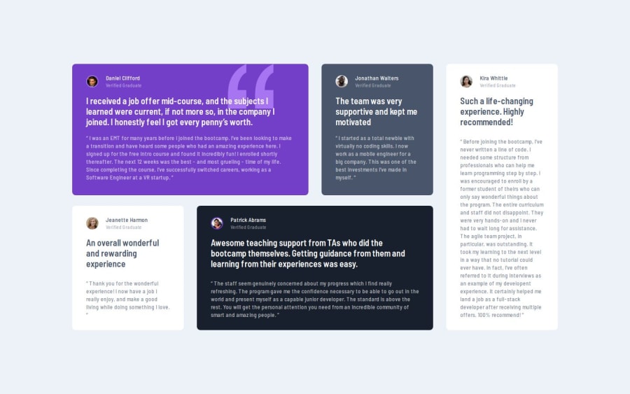
Testimonials Grid Section with Next.js, Tailwind CSS


Design comparison

Solution retrospective
This was a much more challenging task than I initially anticipated. Each card had slight differences in size, and the first card was completely different. I'm extremely proud that I didn't give up and managed to complete it to the end. Grid is truly amazing, but I think it will take more time to get used to than flexbox. That's why I plan to continue using grid and practice with it in the future.
I've created a separate view for tablets to ensure a natural responsive design, even though it wasn't in the original design specifications. Please come and take a look!
What challenges did you encounter, and how did you overcome them?First, handling the transition from desktop to mobile was incredibly difficult. Since the desktop layout was challenging, I started working on the desktop view first, but I struggled with how to easily handle the responsive layout. The solution was to use the max-sm, max-lg, etc., classes provided by tailwindcss. These classes allow developers using a desktop-first approach to perfectly apply responsive design.
Second, there were too many conditional renderings, which made the code increasingly difficult to read. I was able to solve this using the clsx module. By handling complex logic with functions using clsx, the component became much cleaner.
What specific areas of your project would you like help with?I welcome any tips that you might have gained while working on this project. 😄
Community feedback
Please log in to post a comment
Log in with GitHub
Join our Discord community
Join thousands of Frontend Mentor community members taking the challenges, sharing resources, helping each other, and chatting about all things front-end!
Join our Discord