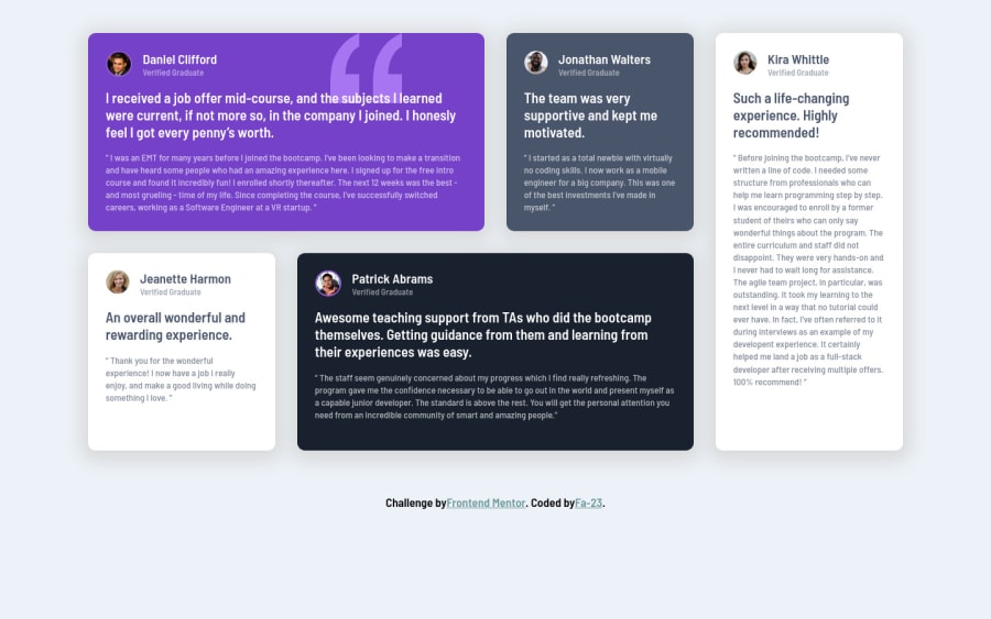
Testimonials grid section with html and css
Design comparison
Solution retrospective
Hi! i really tried but it´s the best i can do for now. Any feedback is welcome
Community feedback
- @shashreesamuelPosted almost 3 years ago
Good job with this challenge Fa-23. Keep up the good work.
Your solution looks exactly like the design in my opinion however I noticed you have some accessibility issues.
-
Your relative image url have a backslash which is not allowed. Instead use
images/ -
Use html semantic tags to properly define what each block of code represents in your document.
I recommend reading up on html semantic tags if you are unfamiliar.
I hope this helps
Cheers, Happy coding 👍
Marked as helpful0 -
- @GitHub-dev12345Posted almost 3 years ago
❤️👍 My small suggestion : 1.In Card design CSS Code Used this:
transform : scale(0.8); this property decrease the size of card. 😉
large size for increase the number of scale & small size for decrease the number of scale
I hope you find this helpful
Marked as helpful0@Fa-23Posted almost 3 years ago@GitHub-dev12345 I really appreciate the suggestions, thanks a lot
0 - @GitHub-dev12345Posted almost 3 years ago
Congratulation 🚀😁 complete your challenge. Used this code want your card in center position :
in body tag Used this CSS Code: body{ display : flex; justify-content: center; align-item: center; }
in Card Design CSS Code used this property: align-self: center;
Marked as helpful0
Please log in to post a comment
Log in with GitHubJoin our Discord community
Join thousands of Frontend Mentor community members taking the challenges, sharing resources, helping each other, and chatting about all things front-end!
Join our Discord
