

Design comparison
SolutionDesign

Solution retrospective
What are you most proud of, and what would you do differently next time?
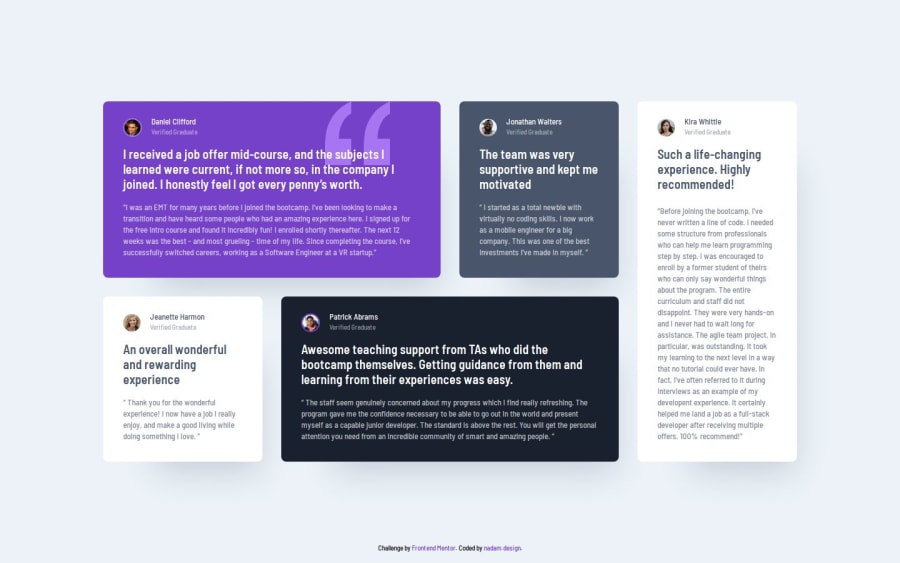
I am most proud of noticing that the distance between the h2 and the quote varies on each card, which happens because the text is always aligned to the bottom of the card. I solved this using flex (space-between).
What challenges did you encounter, and how did you overcome them?At first, what seemed like the most challenging task was giving each card a unique color, which I tried to solve with the least amount of CSS. It’s often difficult for me to think in such a forward-planning, systematic way, and this is something I need to improve!
Community feedback
- @AnaghaInoweiPosted 3 months ago
A perfect replica.
1

Please log in to post a comment
Log in with GitHubJoin our Discord community
Join thousands of Frontend Mentor community members taking the challenges, sharing resources, helping each other, and chatting about all things front-end!
Join our Discord