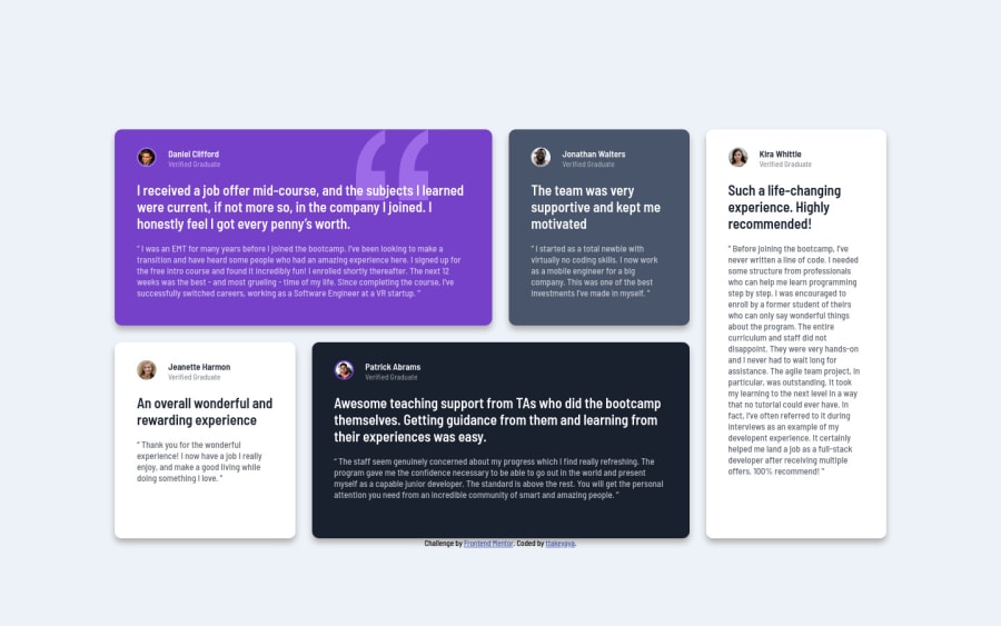
Design comparison
SolutionDesign
Solution retrospective
Any suggestions would be appreciated!
Community feedback
- @yuenuPosted about 3 years ago
Hi, @Take
Nice work, it looks pretty good but there's a suggestion that would make the layout look better
- On mobile, on className testimonials you can changing your
grid-template-rowsproperty to minmax , you don't defined the rows by yourself
And I would add
.testimonialpadding-bottom.testimonials { grid-template-rows: minmax(0, auto); } .testimonial { padding: 2.6rem 3.2rem 2.6rem 3.2rem; }0@ttakeyayaPosted about 3 years ago@yuenu
Thank you for your comment. Your idea would improve the site. I'll tweak the points you mentioned.
0 - On mobile, on className testimonials you can changing your
- @muhammadshajjarPosted about 3 years ago
Hi Take, Nice work on this one some suggestions would help you
- Try to add
max-widthto your body or make a container class that wraps your all content, by adding it you can control your content from growing too much on larger viewports - To overcome your accessibility issue you would need to add some semantic markers to designate sections of the page as the header, navigation, main content, and footer e.g:
<main> <section> </section> </main> <footer> <div class="attribute"></div> </footer>- Page should contain one 'h1'
- Use
bloclquotesfor quotes instead of usingp
0@ttakeyayaPosted about 3 years ago@muhammadshajjar
Thank you for your suggestions! I'll fix those.
0 - Try to add
Please log in to post a comment
Log in with GitHubJoin our Discord community
Join thousands of Frontend Mentor community members taking the challenges, sharing resources, helping each other, and chatting about all things front-end!
Join our Discord
