Design comparison
Solution retrospective
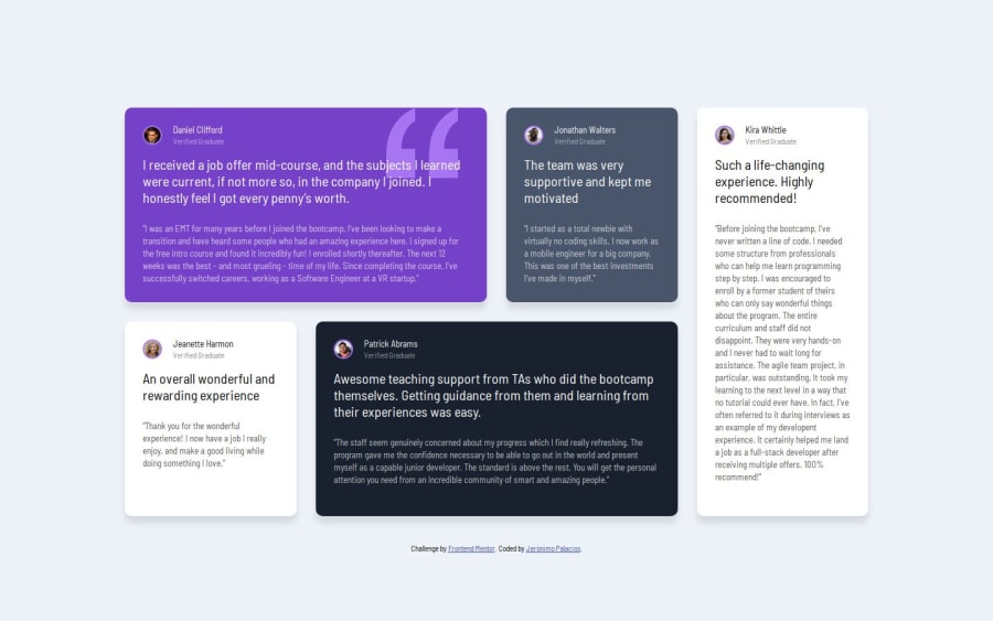
I am happy to get accustomed to CSS Grid. This project was tricker since it was not only positioning elements on the grid, but also making sure that some were not bigger or smaller than the others.
Again, using a mobile-first approach really simplified my workflow
What challenges did you encounter, and how did you overcome them?Figuring out how to make sure all cards occupy the right space. With css grid is a matter of placing them correctly with align-items
There were minor issues with the Figma file. The first card seemed to have different gaps between elements. Is that so?
Join our Discord community
Join thousands of Frontend Mentor community members taking the challenges, sharing resources, helping each other, and chatting about all things front-end!
Join our Discord
