Design comparison
Solution retrospective
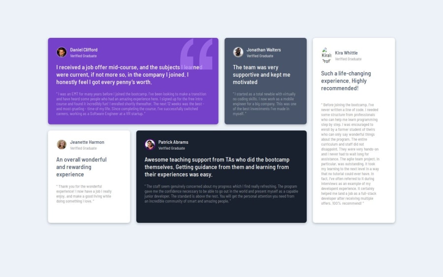
idk
What challenges did you encounter, and how did you overcome them?I didn't know what to do with the quotation mark so I watched a video to learn. That was the hardest part. Everything else fell into place. For media queries I had to look at another persons live Repositories because I am not that creative when it comes to design but I made my own code. I got the box-shadow from CSS scans because I suck at box-shadows.
What specific areas of your project would you like help with?I don't know why my solution looks weird but in the live repository it looks normal can anyone help me with that?
Also how do I center the wrapper without messing with the sizing of the cards? I tried align-items and justify-content but it just messes with some of the cards.
Please log in to post a comment
Log in with GitHubCommunity feedback
- @kodan96
hi there! 👋
You don't have enough rows in your grid layout, the testimonials in the 1st line take up two rows, the 2nd line got only one row, so there's no enough space for it to display the text within the parent, that's why it's overflowing. try to add one more rows to the layout.
Also, if you want to center your content don't apply padding to the
bodyto do it.use flexbox on the body like this:body { min-height: 100vh; display: flex; justify-content: center; align-items: center; }Hope this was helpful 🙏
Good luck and happy coding! 💪
Marked as helpful - @Mustypro137
Try 👍
Join our Discord community
Join thousands of Frontend Mentor community members taking the challenges, sharing resources, helping each other, and chatting about all things front-end!
Join our Discord
