Design comparison
Solution retrospective
hi everyone if he has things to improve all comments are welcome thank you.
Please log in to post a comment
Log in with GitHubCommunity feedback
- @Sk7867
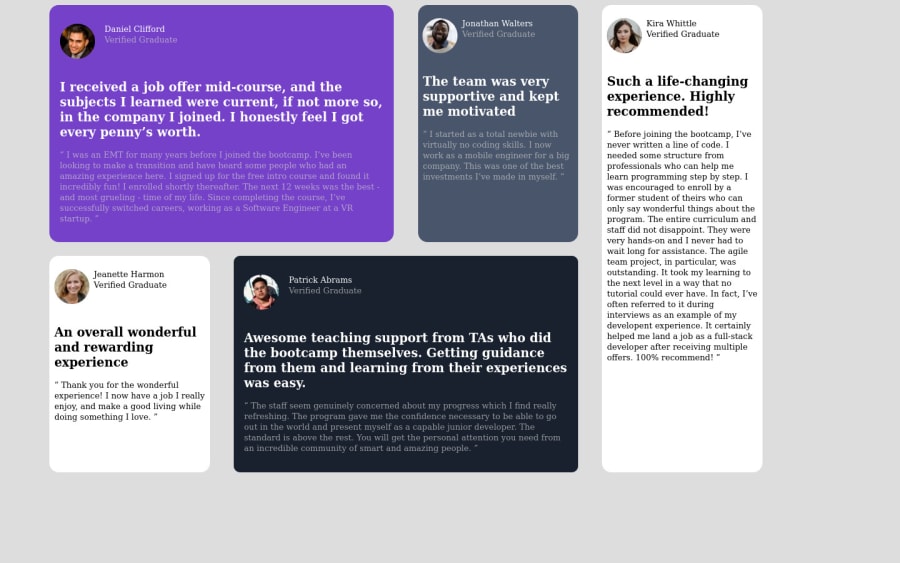
It looks good but needs some fine-tuning as palgramming said. I would like to point that you missed box-shadow effect on bottom boxes and right box.
- @ellienndea
This looks good so far. 😊 For a better horizontal centering and a vertical centering, you could make the body a flex-container with a min-height of 100vh(viewport height) and justify-content: center and align-items: center. Happy coding! 😀
- P@palgramming
Well it looks like you got a good start to this challenge. Your user icons looks a little to large and the Daniel and Patrick ones should have a purple border around them. With some fine tuning you will end up with a great solution
Join our Discord community
Join thousands of Frontend Mentor community members taking the challenges, sharing resources, helping each other, and chatting about all things front-end!
Join our Discord
