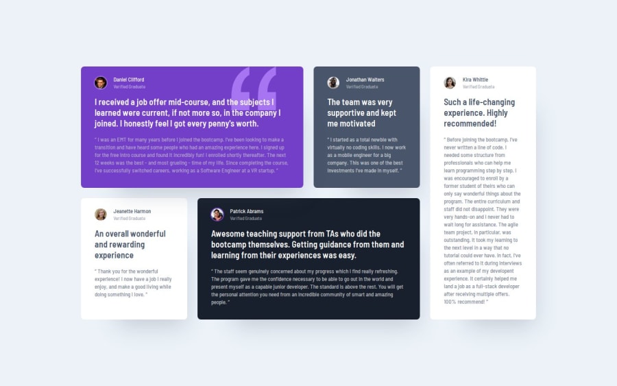
Testimonials Grid Section using Tailwind CSS
Design comparison
Solution retrospective
This challenge went over fairly smoothly. One thing I would change next time, is change the root font size so that sizing may be a little more simple or more uniform than trying to use rems and ems at a larger font size.
What specific areas of your project would you like help with?I feel like even though I followed the design spec and properly calculated my rems, it feels like the cards still don't match the width like in the design. I tried adjusting the grid gap and the grid container width, but I still couldn't get the paragraphs to line up exactly like the design. I'm not sure what my next step would be unless it is changing the root font size and adjusting my rems based on that change.
Community feedback
- @frost3dWavePosted 5 months ago
It could be because your font size is a bit larger I think. Try playing around with it & you will get it. Your grids are perfect.
Great work on the project.
Marked as helpful1
Please log in to post a comment
Log in with GitHubJoin our Discord community
Join thousands of Frontend Mentor community members taking the challenges, sharing resources, helping each other, and chatting about all things front-end!
Join our Discord
