Design comparison
Community feedback
- @thomasweitzelPosted 5 months ago
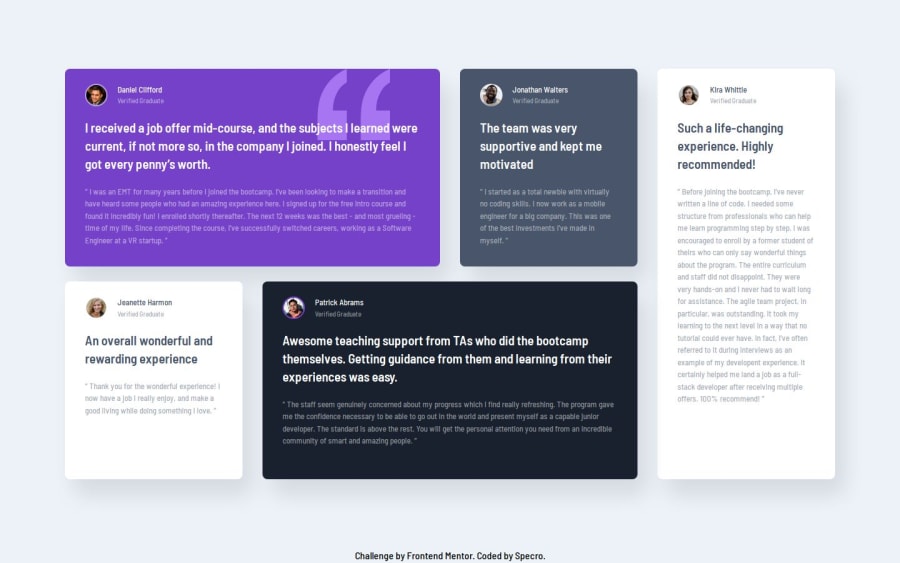
I think you demonstrate a strong understanding of Tailwind CSS, responsive design principles, and modern web development techniques with React and Vite. The thoughtful use of utility-first styling, customized theme configurations, and grid layouts makes the design visually appealing and adaptable to various screen sizes. Especially, I like your thoughtful spacing with
gap-y-6andgap-x-8for consistent design alignment. I believe you could further enhance your solution with some accessibility markup and semantic markup, like wrapping a testimonial card in an "article" element:<article aria-labelledby="daniel-title"> <!-- ... -> <h2 class="text-white flex flex-col text-sm" id="daniel-title">Daniel Clifford</h2> <!-- ... --> </article>Overall - like always so far - I like your solution to the challenge!
Marked as helpful0
Please log in to post a comment
Log in with GitHubJoin our Discord community
Join thousands of Frontend Mentor community members taking the challenges, sharing resources, helping each other, and chatting about all things front-end!
Join our Discord
