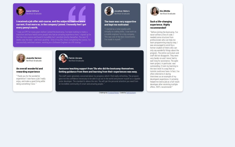
Design comparison
Solution retrospective
That I finished this work in less than a day. Next time I will try my best to work faster.
What challenges did you encounter, and how did you overcome them?How to use grids. I overcame this by watching a few tutorials on using grids.
What specific areas of your project would you like help with?To create a mobile design for this challenge. How was the grids used in this challenge to get the right propotions.
Community feedback
- @LuisPerez2008Posted 5 months ago
very good bro just in grid-template-columns try to use 1fr something like this. grid-template-columns: 1fr 1fr 1fr 1fr ; and grid-template-areas: “daniel daniel jonathan kira” “jean patrick patrick kira”; the 1fr divides the size in equal parts and with that more will be exact . don't get discouraged keep moving forward
0 - @EGUERREROP0Posted 5 months ago
Very good, You are progressing very well, go at your own pace, don't stress.
0
Please log in to post a comment
Log in with GitHubJoin our Discord community
Join thousands of Frontend Mentor community members taking the challenges, sharing resources, helping each other, and chatting about all things front-end!
Join our Discord
