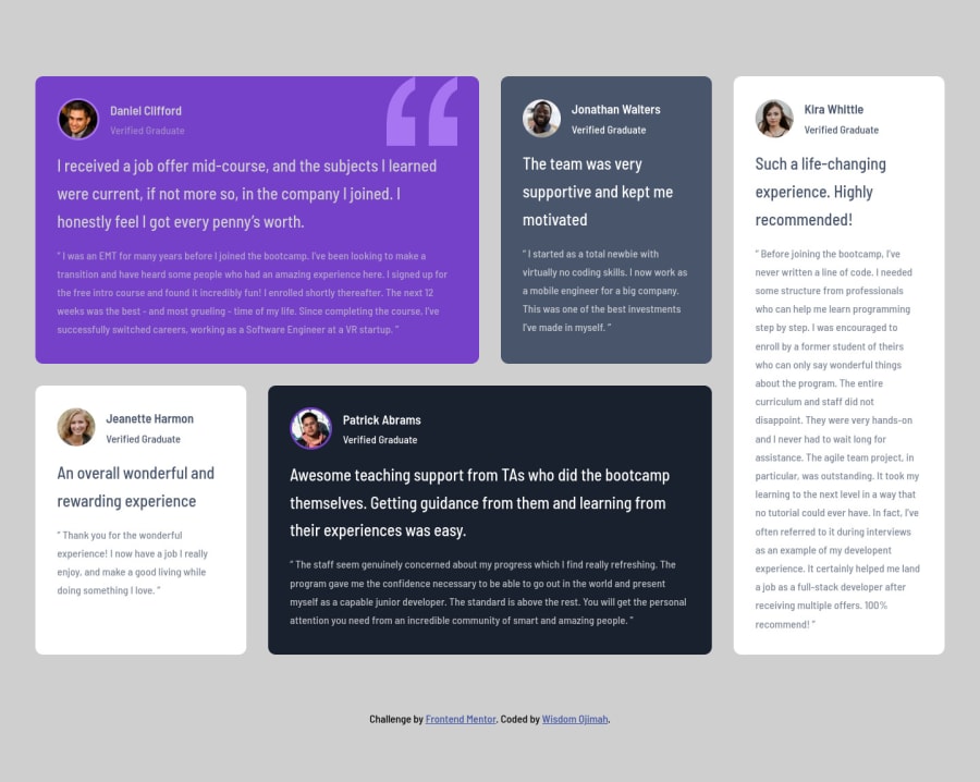
Testimonials Grid Section Using Flexbox and CSS Grid
Design comparison
Solution retrospective
Any suggestions on how to make this better would be highly appreciated.
Community feedback
- @ApplePieGiraffePosted over 3 years ago
Hey there, Wisdom Ojimah! 👋
Good job on this challenge! 👏 Your solution looks pretty good and responds very well! 😀
One or two very minor design suggestions I might have is to decrease the line-height of the headings just a little and making sure the heading of the white testimonial card sticks to the right side of the card in the tablet layout (currently, it remains in the middle of the card). That's all, though! 😉
Keep coding (and happy coding, too)! 😁
0@detachedsoulPosted over 3 years ago@ApplePieGiraffe, thanks for the review. I've fixed the issues you spotted. 😉
0
Please log in to post a comment
Log in with GitHubJoin our Discord community
Join thousands of Frontend Mentor community members taking the challenges, sharing resources, helping each other, and chatting about all things front-end!
Join our Discord
