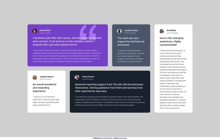


Design comparison
SolutionDesign

Solution retrospective
Any Feedback about this challenge would be Appreciated
Community feedback
- Account deleted
In this challenge I found it better to have fixed widths for the desktop and when the window is resized and reaches tablet view, then I'd change the layout to something suitable then on mobile you can use vw/% instead of px.
- I think this works because on your solution when you resize the containers get very small in width to a point that it doesn't look good... you could have maybe set a minimum width.
1@aryanat1911Posted about 3 years ago@thulanigamtee Ohh, Next time I'll try this for sure brother. Thank you so much
0
Please log in to post a comment
Log in with GitHub
Join our Discord community
Join thousands of Frontend Mentor community members taking the challenges, sharing resources, helping each other, and chatting about all things front-end!
Join our Discord