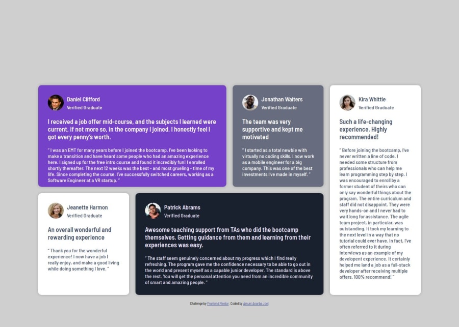


Design comparison

Solution retrospective
I'm proud of how I successfully implemented a fully responsive layout using CSS Grid and Flexbox. It was satisfying to see the design adapt smoothly across different screen sizes.
Next time, I would focus more on optimizing my media queries and ensuring my CSS is as clean and reusable as possible. I also plan to experiment with CSS variables to make styling adjustments more efficient.
What challenges did you encounter, and how did you overcome them?One of the biggest challenges was handling the grid layout on larger screens (1440px). At first, I struggled with getting the testimonial cards to align properly. I solved this by adjusting the grid-template-columns and using gap instead of relying on margins.
Another challenge was managing text overflow in smaller screen sizes (375px). To fix this, I tweaked the font sizes and padding to maintain readability.
What specific areas of your project would you like help with?I'd appreciate feedback on:
- CSS best practices – Are there any areas where I could write more efficient or maintainable CSS?
- Accessibility improvements – Did I properly structure my HTML for better accessibility?
- Alternative layout techniques – Are there better ways to achieve the same grid layout using modern CSS features?
Community feedback
Please log in to post a comment
Log in with GitHub
Join our Discord community
Join thousands of Frontend Mentor community members taking the challenges, sharing resources, helping each other, and chatting about all things front-end!
Join our Discord