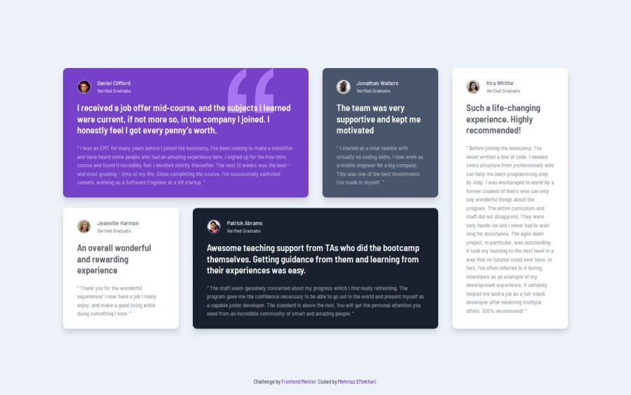
testimonials grid section using css grid
Design comparison
Community feedback
- P@kaamiikPosted 6 months ago
Hi. Congrats for doing this grid challenge. I see some little issues I wanna mention:
-
Add some margin or padding to the left and right of the main element to prevent it from touching the edges of the screen when the page is resized smaller.
-
The avatars do not need alt message. And also do not use the word image for the alt message.
-
For each card you have a quote. Instead of using
pfor this, you can useblockquotetag that is more semantic and really proper for here. You can use it like this:
<blockquote> <p class="testimonial-title"> The team was very supportive and kept me motivated </p> <p class="testimonial"> I started as a total newbie with virtually no coding skills. I now work as a mobile engineer for a big company. This was one of the best investments I’ve made in myself. </p> </blockquote>- I have a suggestion for your blockquote also if you’d like to add it. One of the use cases of pseudo-classes
::beforeand::afteris that you can add quotation marks that are before and after the text with content property. The reason is that this way, for example, when selecting text with the mouse, those quotation marks are no longer selected. Here the code:
.testimonial::before { content: "“"; } .testimonial::after { content: "”"; }2@mehrnaz98Posted 6 months agoHi @kaamiik ! Thank you for the feedback and helpful suggestions. I’ve noted them and applied them. The tip about using ::before and ::after for quotation marks is great—I’ll keep that in mind! Thanks again for your insights!
1 -
Please log in to post a comment
Log in with GitHubJoin our Discord community
Join thousands of Frontend Mentor community members taking the challenges, sharing resources, helping each other, and chatting about all things front-end!
Join our Discord
