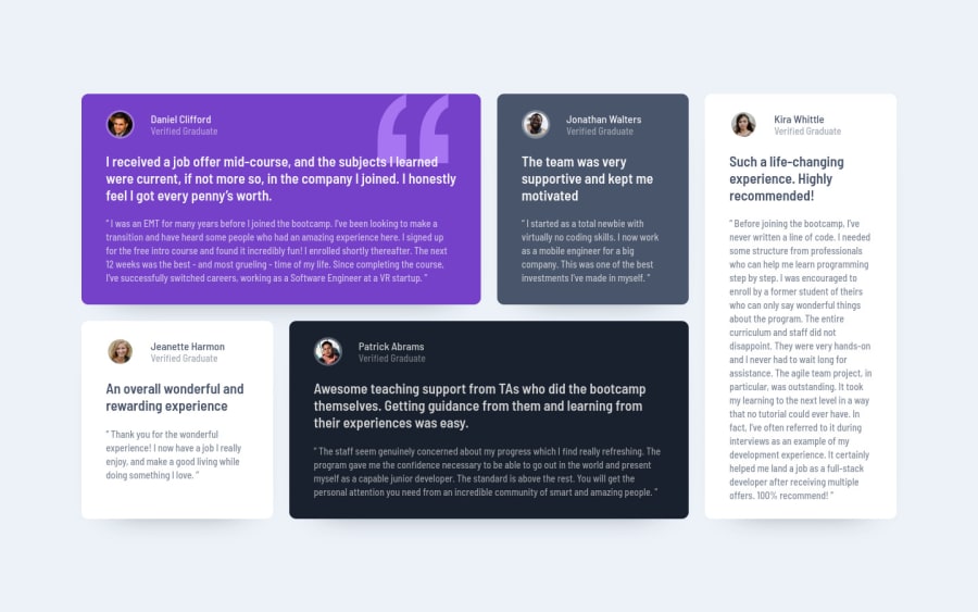
Design comparison
Solution retrospective
Please take a look at my HTML code and suggest any improvements. I appreciate it!
Community feedback
- @correlucasPosted over 2 years ago
👾Hello Aram, congratulations for your new solution!
You've a great solution here and I can see you paid a lots of attention for everything. The grid layout is fully responsive and the media query is working fine! The only thing to improve is the amount of
divyou've used here, note that many of these card elements can stand alone without a div to wrap it, the only block that really need a div is the block with theprofile photo + job title, if you delete these unnecessary divs you'll reduce a big chunk of code since this divs will repeat around all the cards.✌️ I hope this helps you and happy coding!
Marked as helpful0@correlucasPosted over 2 years ago@OhSorrow You're welcome Aram. Your solution is really good! I was impressed that you've used all the semantic tags correctly! Amazing to see this level of detail.
1 - @romila2003Posted over 2 years ago
Hi Aram,
Congratulations 🎉 for completing this challenge, the Testimonials looks great and is responsive. There are some issues regarding your HTML, and CSS I want to address:
- Since you are using the
articletag, you need to include the heading tag which can vary fromh2toh6 - In desktop, I would strongly suggest you remove the
paddingproperty from themaintag since it is creating an overflow, where users would have to scroll down the page to see the bottom of the cards. - To prevent the cards from being too wide, you can give the
maintag amax-widthof1440px.
Overall, great attempt and wish you the best for your future projects so keep coding 👍.
Marked as helpful0@OhSorrowPosted over 2 years ago@romila2003 Hi dear Romila! Thanks a lot for your comment! It was very helpful. But there is a problem, as you can see in the screenshot above, the page is not centered like the design. What should I do now? Is this coming from
font-sizeor something?1@romila2003Posted over 2 years ago@OhSorrow Hi Aram, I'm glad to be of help, there are 2 issues I can think of.
- The width of the container may still be too wide so you can reduce that to around
1200px. - The size of your cards are also bigger in comparison.
Overall, you should not worry too much about trying to make your design pixel perfect, as long as they look as similar as possible. I realised that the screenshots do not always represent the actual design, on the website.
Marked as helpful0@OhSorrowPosted over 2 years ago@romila2003 Thanks for your guidance! The webpage is now much better!
1 - Since you are using the
Please log in to post a comment
Log in with GitHubJoin our Discord community
Join thousands of Frontend Mentor community members taking the challenges, sharing resources, helping each other, and chatting about all things front-end!
Join our Discord
