Submitted about 1 year ago
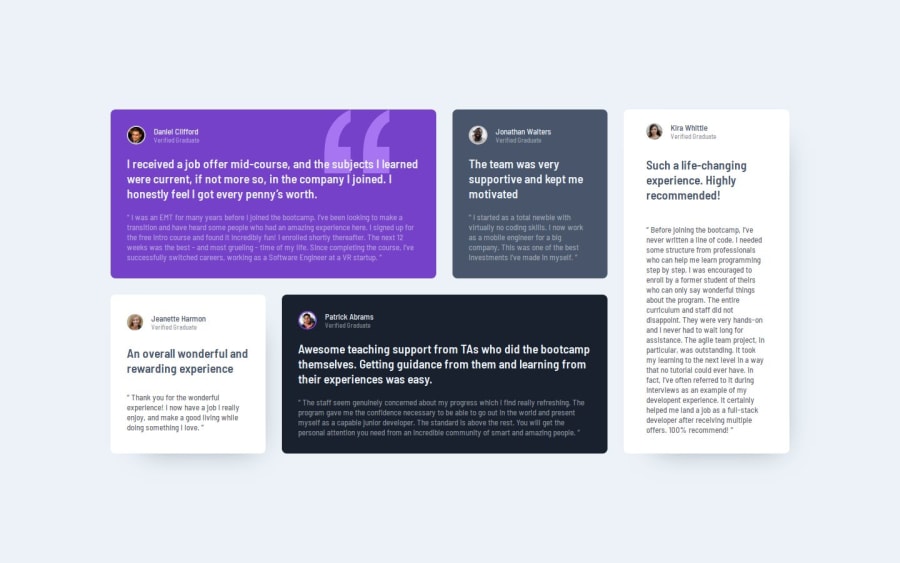
Testimonials grid section using CSS Grid
P
@Antonvasilache
Design comparison
SolutionDesign
Solution retrospective
What are you most proud of, and what would you do differently next time?
- Used grids effectively to create the desired layout
- Used background pattern and configured it as per the design
- Used css classes to differentiate between similar elements with different properties
- Took a while to figure out the proper colours for each paragraph.
- Matching the height of the last testimonial with the other ones - did it using a flex container.
- Using the background pattern on the first testimonial - managed to position it using percentage.
- Restyling the testimonial containers for mobile screens - needed resetting the columns to 1, but also the positioning, like so
 .testimonial--large-2 {
    grid-column: 1;
  }
Maybe a more reliable way of styling box shadows.
Community feedback
- @Medido1Posted about 1 year ago
great idea to have mulitple break points!! i'll try to apply that to my own challenge
1
Please log in to post a comment
Log in with GitHubJoin our Discord community
Join thousands of Frontend Mentor community members taking the challenges, sharing resources, helping each other, and chatting about all things front-end!
Join our Discord
