Design comparison
SolutionDesign
Solution retrospective
What are you most proud of, and what would you do differently next time?
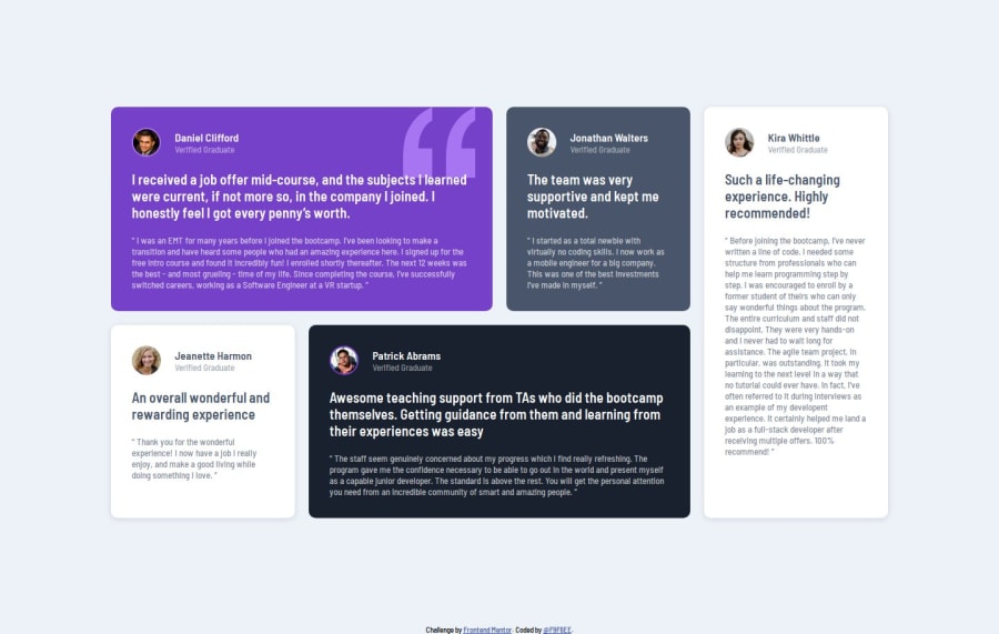
i'm proud of the final result, next time i would use "grid area" instead of "grid template column" which look kind more simple.
What challenges did you encounter, and how did you overcome them?i have some issues with the mobile ratio, the first testimonial don't show up and i don't understand why if you have some suggestion please, feel free to comment so it help me to resolve it. Thanks
What specific areas of your project would you like help with?Try to use grig area.
Community feedback
- @kiran63616456Posted 5 months ago
Everything is perfect, the only this is focus on background patten quotation placing.
0
Please log in to post a comment
Log in with GitHubJoin our Discord community
Join thousands of Frontend Mentor community members taking the challenges, sharing resources, helping each other, and chatting about all things front-end!
Join our Discord
