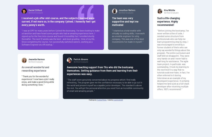
Design comparison
Solution retrospective
I'm proud that I really learned a lot about the grid display and it's items.
What challenges did you encounter, and how did you overcome them?Well, I didn't know anything about grid, so it was a whole new experience for mes, but I still managed to do it, so I guess I'm glad about that.
What specific areas of your project would you like help with?Any tips in general are very welcome, but specifically any tips about grid layouts.
Community feedback
- @AdrianoEscarabotePosted about 1 month ago
Hi Israel Andreotti, how are you doing? I really loved the outcome of your project, but I have a few suggestions that I think might be helpful:
A good practice to center content is using grid or flex-box, avoid using margin or padding to make placements, use only in the latter case! we can do it like this:
FLEXBOX
body { background-color: var(--light-grayish-blue); height: 100vh; display: flex; align-items: center; justify-content: center; flex-direction: column; }
GRID
body { display: grid; min height: 100vh; place-content: center; }
The rest is excellent.
I hope you find it useful. 👍
Marked as helpful0@Israel-AndreottiPosted about 1 month ago@AdrianoEscarabote Olá Adriano! Vi que você é brasileiro então podemos falar em português mesmo... muito obrigado pela dicaz eu realmente tive dificuldades em centralizar o container grid verticalmente
1@AdrianoEscarabotePosted about 1 month ago@Israel-Andreotti melhor ainda então kkkkkkk é um problema comum eu tbm tive no começo kkk
0
Please log in to post a comment
Log in with GitHubJoin our Discord community
Join thousands of Frontend Mentor community members taking the challenges, sharing resources, helping each other, and chatting about all things front-end!
Join our Discord