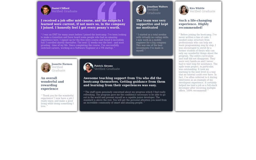
Design comparison
SolutionDesign
Solution retrospective
As we are making this only for mobo and desktop device, when we resize our window to some width between this to it become very weird and do not look good.
Community feedback
- @asmaa-elfatayryPosted almost 2 years ago
HI Krish, you really did a great job. to remove the warning, you should add all the content of the body in the <main></main> tag.
to make the design responsive you should change the flex in small screen like this: flex-direction:column;
hope this can help you: https://www.youtube.com/watch?v=zqSXT4pHD9g https://www.youtube.com/watch?v=S0a7PEOi0do
Or you can use grid too: https://www.youtube.com/watch?v=rg7Fvvl3taU
Marked as helpful1
Please log in to post a comment
Log in with GitHubJoin our Discord community
Join thousands of Frontend Mentor community members taking the challenges, sharing resources, helping each other, and chatting about all things front-end!
Join our Discord
