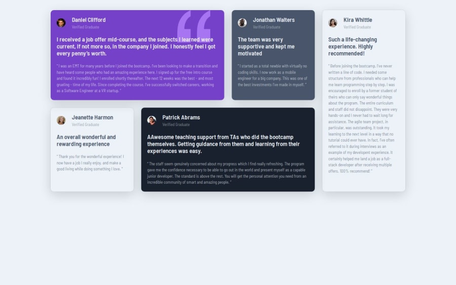
Design comparison
Solution retrospective
work with some advice from my last solutions
What challenges did you encounter, and how did you overcome them?i still get confusion with responsive units like using rem or em with padding margins fonts
What specific areas of your project would you like help with?i need some resources in how to make fonts and padding responsive and work with units like rem em also I noticed some solution use this units for screen breakpoint I really need some resources to understand it
Community feedback
- @0xabdulkhaliqPosted 7 months ago
Hello there 👋. Congratulations on successfully completing the challenge! 🎉
- I have a suggestion regarding your code that I believe will be of great interest to you.
CSS 🎨:
- Looks like the component has not been centered properly. I figured our that you're using
margin
for that. But it will not help us to center the component both horizontally & vertically**.
- To properly center the component in the page, you should use
Flexbox
orGrid
layout. You can read more about centering in CSS here 📚.
-
You already did a great job in using
Grid
layout formain
element as per the design. So we can use Grid to center the component, -
Here's an example:
body { min-height: 100vh; display: grid; place-items: center; }
- Now remove these styles, after removing you can able to see the changes
.container { margin-inline: auto; }
- Now your component has been properly centered
.
I hope you find this helpful 😄 Above all, the solution you submitted is great !
Happy coding!
Marked as helpful0@bennahiaoualidPosted 7 months agothank you so much that what i was looking for @0xabdulkhalid
0
Please log in to post a comment
Log in with GitHubJoin our Discord community
Join thousands of Frontend Mentor community members taking the challenges, sharing resources, helping each other, and chatting about all things front-end!
Join our Discord