Submitted over 3 years ago
Testimonials grid section solution - with Grid and Flexbox

@GoranK89

Design comparison
SolutionDesign

Solution retrospective
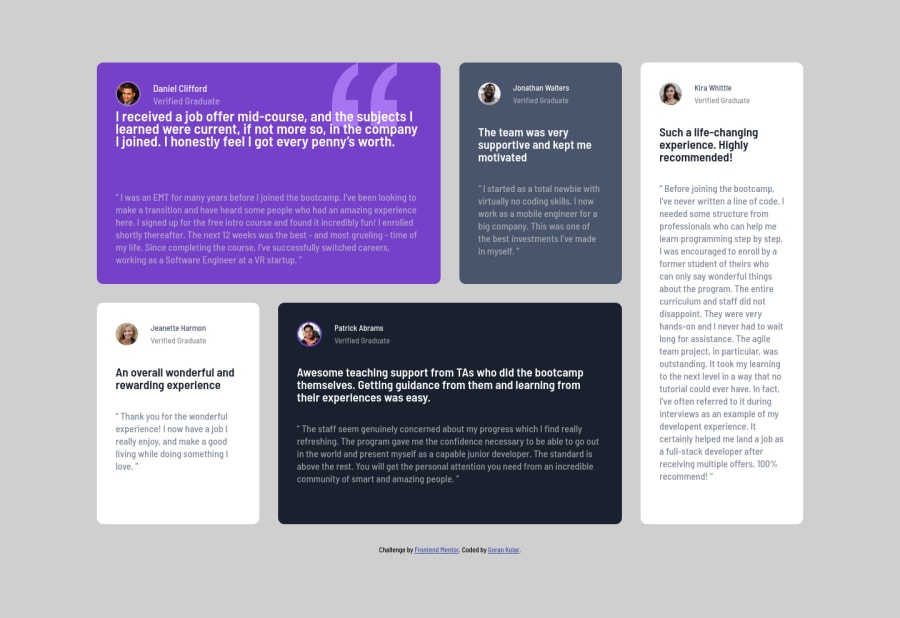
This challenge was harder than expected, especially the first card, which was glued together with absolute positioning (not sure if thats good). Another issue is the spacing below the paragraphs in the 2nd row, not sure currently how to approach that. Overall it feels like I also used a lot of unnecesary CSS selectors, so any future changes to this challenge might be a bit confusing.
Please log in to post a comment
Log in with GitHubCommunity feedback
- @NitaLewska
Hi! I'd recommend you to read about CSS Grid and to try to rebuild this project using it. Using absolute positioning for each isn't really the best idea, as it kills responsiveness at some point.
Marked as helpful

Join our Discord community
Join thousands of Frontend Mentor community members taking the challenges, sharing resources, helping each other, and chatting about all things front-end!
Join our Discord