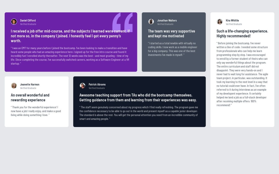
Testimonials grid section solution using Tailwind CSS
Design comparison
Solution retrospective
I learned to make grid layout using Tailwind CSS. This layout can be used in future projects and my portfolio website for adding testimonials.
Community feedback
- @JeuriMorelPosted over 1 year ago
The easiest way to center an item is to make its parent a flex box, so I would give the
bodythe following:display: flex; justify-content: center; align-items: center; min-height: 100vh;the
min-heightis so that it takes up the full screen. This will perfectly center the grid section once you remove themargin-topon it.The grid section appears to be too wide, so I would give it a
max-widthof something more pleasing and closer to the design, maybe1200pxor so.Marked as helpful0
Please log in to post a comment
Log in with GitHubJoin our Discord community
Join thousands of Frontend Mentor community members taking the challenges, sharing resources, helping each other, and chatting about all things front-end!
Join our Discord
