

Design comparison
SolutionDesign

Solution retrospective
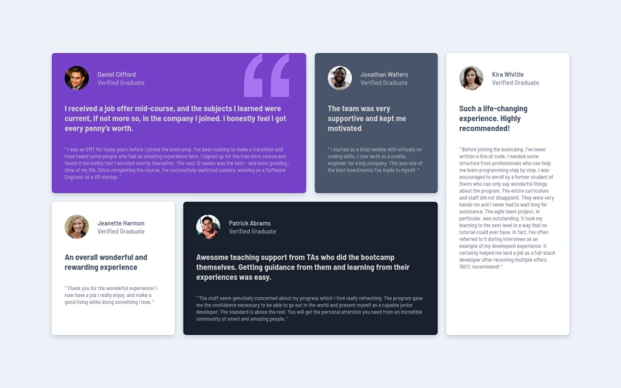
Since I have no idea about what the site looks like on a tablet, I have made my own arrangement of the grid. I know it's not a good idea to have a long paragraph as I have on the last grid of the tablet version. Kindly give me an idea of how can I make it look better. Also, any feedback or improvements on my code is highly appreciated. How can I fix the quote in the correct position? Thanks.
Community feedback
Please log in to post a comment
Log in with GitHubJoin our Discord community
Join thousands of Frontend Mentor community members taking the challenges, sharing resources, helping each other, and chatting about all things front-end!
Join our Discord