Testimonials Grid Section Solution
Design comparison
Solution retrospective
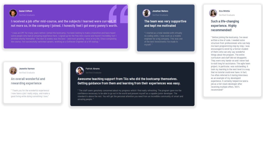
It took me more than a week to finish this project. I tried mobile first Approach, and after that i found it difficult to design bigger screen. I used React and Use Component to render each card. it was difficult for me to make this layout using grid. Even though i Finished this project.
What challenges did you encounter, and how did you overcome them?Designing for desktop with that layout was challenging for me. It took me more than a week to find solution for the problem that i faced in grid layout.
What specific areas of your project would you like help with?In my desktop version, My card is not occupying the space it was meant to occupy.
Community feedback
- @BeinRain06Posted about 2 months ago
Hye Ajaya how amazing job that you have done so far while resisting to quit the project.
This is one of my favourites , of course you have seen it the layout are two dimensions based as you see in the desktop version, that make this project a good candidate for grid.
I assume you are new to grid , but don't worry i will give you some clues.
- Grid are good for two dimensional layout
- Grid is build on top of flexbox that means you can also achieve **one dimensional layout using grid
- as a person lock in jail grid box container restrict each children element to act just in the boundary size she has set for each children .
Now looking a the project we have five children in a container that we may want to showcase as grid.
like mobile version is unidimensional we can implement grid using template-areas like this :
/** grid container **/ .grid_class_container { width: 100vw; min-height: 100vh; //is essential to specify height and width in grid either it won;t work well display: grid; grid-template-rows: max-content; grid-template-areas: ' daniel ' 'jeannette' 'jonathan' 'patrick' 'kira' ; } /** here box children **/ #daniel_box { grid-area: daniel; width:100%; height:100%; } #jeannette_box { grid-area: jeannette; width:100%; height:100%; } #jonathan_box { grid-area: jonathan; width:100%; height:100%; } #patrick_box { grid-area: patrick; width:100%; height:100%; } #kira_box { grid-area: kira; width:100%; height:100%; }
here is some kind of desktop version bi-dimensional using also template-areas in grid :
before going to css we remarks in desktop :
-
some cell box are 2 times larger than other in horizontal axis(
daniel_box
,patrick box
) -
other are 2 times larger than other in vertical axis (
kira_box
)
let count the numbers of virtual columns of our grid could be evaluated on the vertical case to (columns= 2(daniel) + 1(jonathan) + 1(kira) ) = 4
let count the numbers of virtual columns of our grid could be evaluated on the horizontal to (rows= 1(daniel) + 1(jeannette) ) = 2
here we go in grid system :
/** grid container **/ .grid_class_container { width: 100vw; min-height: 100vh; display: grid; grid-template-rows: max-content; grid-template-areas: ' daniel daniel jonathan kira ' 'jeannette patrick patrick kira' ; } /** here box children **/ #daniel_box { grid-area: daniel; width:100%; height:100%; } #jeannette_box { grid-area: jeannette; width:100%; height:100%; } #jonathan_box { grid-area: jonathan; width:100%; height:100%; } #patrick_box { grid-area: patrick; width:100%; height:100%; } #kira_box { grid-area: kira; width:100%; height:100%; }
and that it is pretty it !
Thanks you for your time and consideration @Ajaya-Rajbhandari . This is an amazing project and i'm proud you did it and don't quit till the end .
feel free to join me if there is anything else you might want to know about grid system or if got wrong somewhere
I wish you Great Day/ amazing Night followed by a good sleep @Ajaya-Rajbhandari as well as happy coding.
Marked as helpful0@Ajaya-RajbhandariPosted about 2 months agoHey @BeinRain06 ,
Thank you so much for your kind words and for taking the time to review my work! I'm so glad you liked the layout, and your insights into using CSS Grid are incredibly valuable.
I appreciate the explanation of how Grid works, especially the template-areas and the way you broke down the two-dimensional layout. Your tips for both mobile and desktop versions make a lot of sense, and I love how you explained the relationship between Flexbox and Grid—it definitely clears up some confusion I had. I'll be diving deeper into the CSS Grid system with the advice you've given.
Thanks again for your support, and for being so generous with your knowledge. I'll definitely reach out if I have any questions or need more guidance as I refine the project!
Wishing you a great day/night and happy coding as well. 😊
Best regards, Ajaya Rajbhandari
0@clickgluePosted about 2 months ago@Ajaya-Rajbhandari I tried again but still can't see your code on this adres:https://github.com/Ajaya-Rajbhandari/testimonials-grid-sector
Marked as helpful0@Ajaya-RajbhandariPosted about 2 months agoHey @clickglue, Thank you for checking again! I’m sorry you're still having trouble accessing the code. It seems the repository might be private, which is why you’re unable to view it unless you’re logged in. I’ve updated the settings to make sure the repository is public now, so you should be able to access it without logging in.
Here’s the link again: https://github.com/Ajaya-Rajbhandari/testimonials-grid-sector. Could you try one more time and let me know if it works for you now? If there’s still an issue, I’ll be happy to troubleshoot further.
Thanks again for your patience!
Best regards, Ajaya Rajbhandari
1@clickgluePosted about 2 months ago@Ajaya-Rajbhandari Hi Ajaya, it works fine now! And now I can see how you did it, very clean and simple! You embedded the properties and the variable text in the app.js file. I tried to take them out and put them in a seprate file, simulating dynamic content, but that made it complicated and difficult. Very good how you separated the CSS from app.js from the component. I've learned a lot from looking at your code, thank you!
Marked as helpful0@BeinRain06Posted about 2 months ago@Ajaya-Rajbhandari
You are welcome, you are on the right path, keep moving forward with time your layout skills will incredibly become good
We are on the same board, and it is a pleasure i could be a help. ..
Have a good night /day @ajaya
0 - @clickgluePosted about 2 months ago
Hi, I'd love to see your code, but the link gives a 404. I guess you used NEXTJS, and I'm curious about your implementation.
Also, I see you succeeded to implement the background-image property in react, and I'm very curious how you did it because I couldn't get it to work.
Marked as helpful0@Ajaya-RajbhandariPosted about 2 months agoHey @clickglue , Thank you for your review and insights on my project! I wanted to mention that the link works fine from my side, though I’m not sure if it’s only working for me. Could you kindly check if it functions correctly on your end as well?
Regarding the background image in my project, I used Props to pass it dynamically. Here’s the part of the code I implemented:
jsx Copy code
className="card" profilePic={Daniel} userName="Daniel Clifford" postTitle="Verified Graduate" shortDescription="I received a job offer mid-course, and the subjects I learned were current, if not more so, in the company I joined. I honestly feel I got every penny’s worth." description="“ I was an EMT for many years before I joined the bootcamp. I’ve been looking to make a transition and have heard some people who had an amazing experience here. I signed up for the free intro course and found it incredibly fun! I enrolled shortly thereafter. The next 12 weeks was the best - and most grueling - time of my life. Since completing the course, I’ve successfully switched careers, working as a Software Engineer at a VR startup. ”" backgroundImage={Quote} cardId="card1" />
Using Props for the backgroundImage works well for me, but I’d love to hear if you have any suggestions or feedback on this approach.
Looking forward to hearing your thoughts!
Best regards, Ajaya Rajbhandari
0
Please log in to post a comment
Log in with GitHubJoin our Discord community
Join thousands of Frontend Mentor community members taking the challenges, sharing resources, helping each other, and chatting about all things front-end!
Join our Discord